
1/3
Overview
lient Review Slider turns customer feedback into a clean, on-brand social-proof section you can drop onto any landing page, service page or blog post.
Each review card shows a quote headline, the full quote, a 1–5 star rating and the client's name, role and avatar — upload a photo or let the module generate gradient initials automatically. An optional intro panel carries a kicker, heading and call-to-action button, so the section sells as well as it reassures.
Why teams pick it
Editable in minutes. Add, reorder or remove reviews in the Content tab — no code, no HubDB, no CRM setup.
Looks right out of the box. Colours and fonts inherit from your theme settings; every detail (text, background, button, corner radius, shadow, spacing, panel position, animation) can be overridden per instance in the Styles tab.
Adaptive layout. Shows up to four cards per page and rebalances the grid automatically for one, two or three reviews — no awkward empty slots, on desktop or mobile.
Smart navigation. Auto-advance with an editable interval, pause on hover and focus, arrow buttons, page dots, keyboard arrows and touch swipe.
Accessible by default. WAI-ARIA carousel markup, labelled controls, a live region for slide changes, star ratings exposed to screen readers, 24 px+ tap targets and full support for reduced-motion preferences.
Lightweight and safe. Dependency-free vanilla JavaScript and scoped CSS — no jQuery, no external libraries, safe to place several times on one page.
Features
Editable reviews with ratings and avatars
dd, reorder or remove reviews in the Content tab. Each card holds a quote headline, full quote, 1–5 star rating, client name, role and an avatar — upload a photo or let the module generate gradient initials automatically.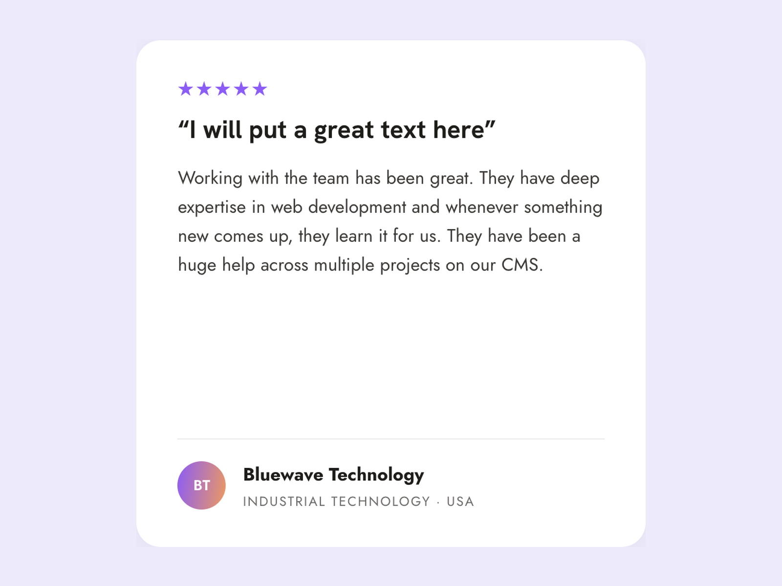
Layout that adapts to any number of reviews
Shows up to four cards per page and rebalances the grid automatically for one, two or three reviews — no awkward empty slots, including on the last page. Stacks into a single column on mobile.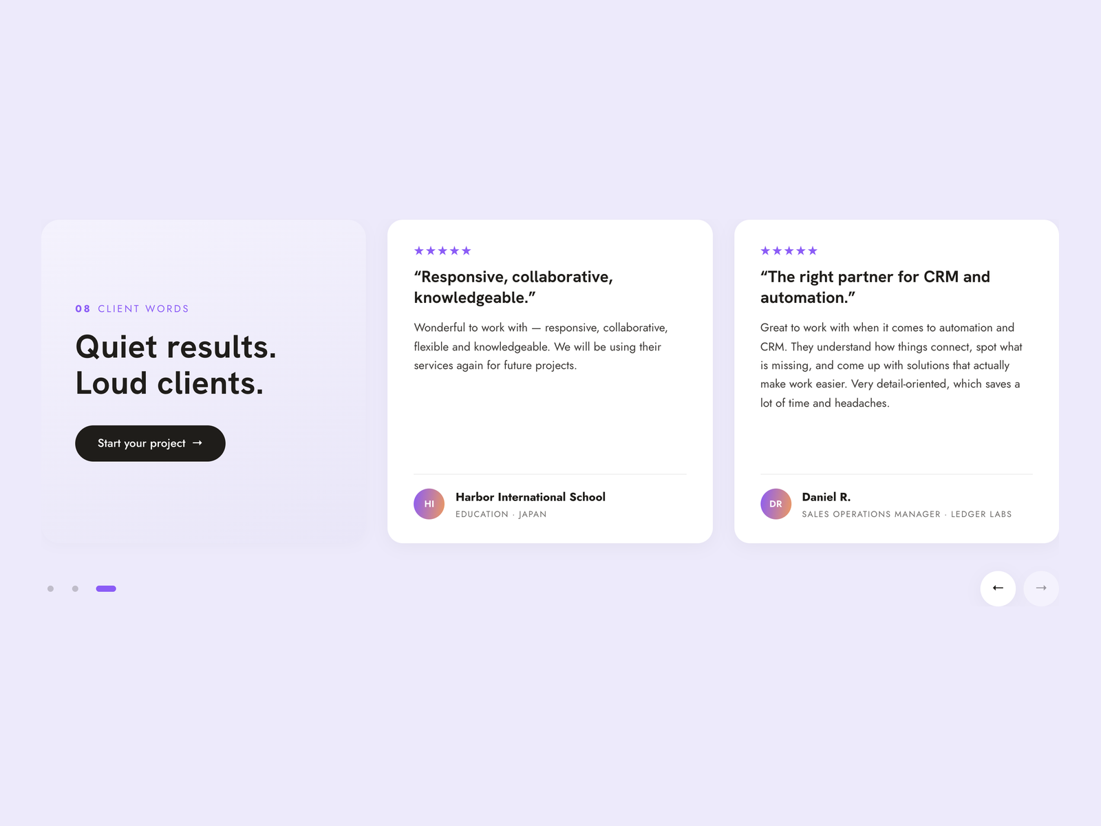
Intro panel with call-to-action
An optional tinted panel carries a section number, kicker, heading and button, so the section sells as well as it reassures. Hide the button or the whole panel with a single toggle; place it left or right of the cards.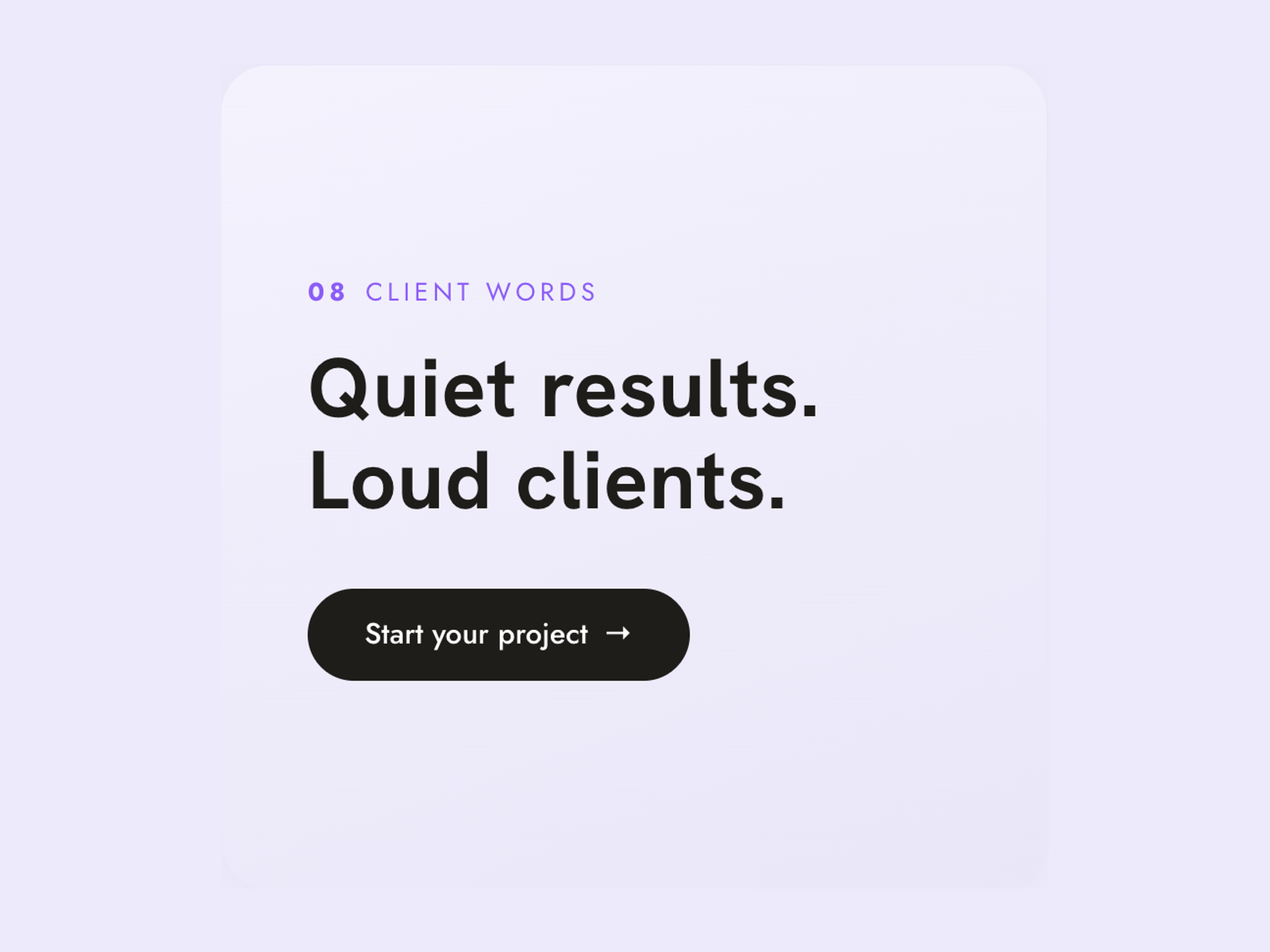
Auto-advance, dots, arrows, keyboard and swipe
Auto-advance at an editable interval that pauses on hover and focus, plus page dots, arrow buttons, keyboard arrows and touch swipe. Built with dependency-free vanilla JavaScript and safe to use several times on one page.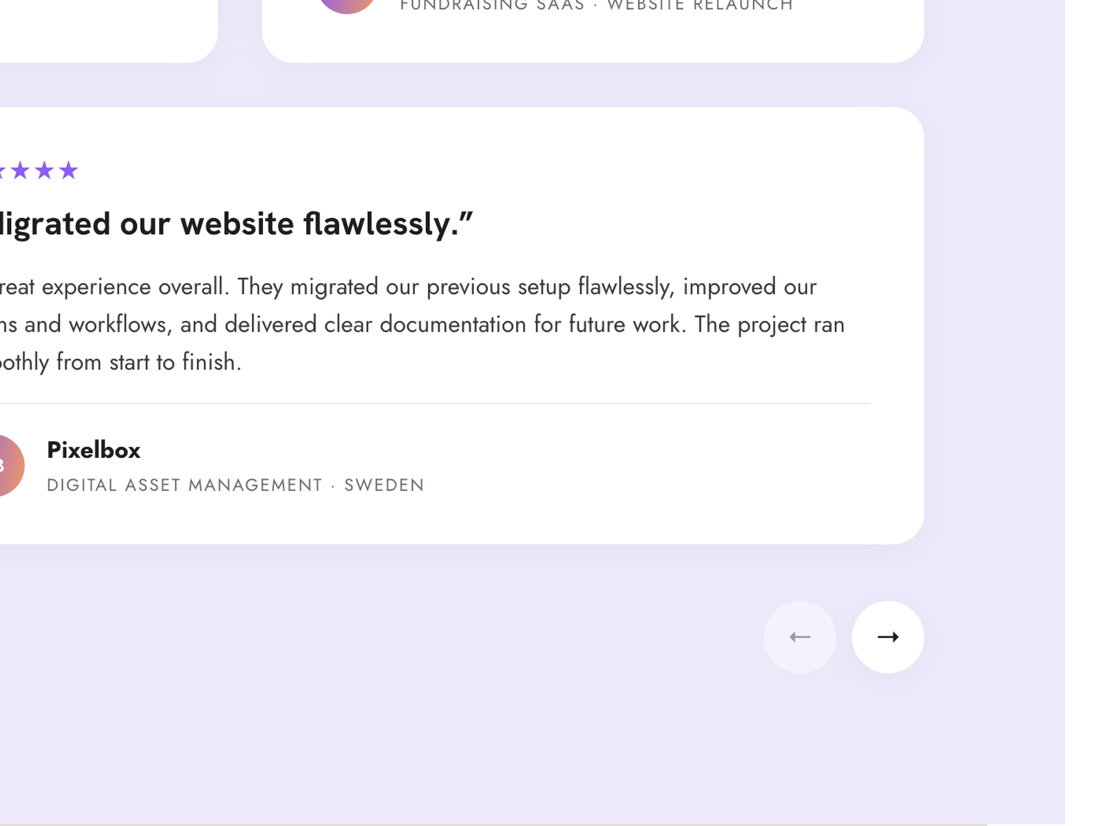
Inherits your theme and stays accessible
Colours and fonts come from your theme settings and can be overridden per instance in the Styles tab. WAI-ARIA carousel markup, labelled controls, a live region, 24 px+ tap targets and full reduced-motion support are built in.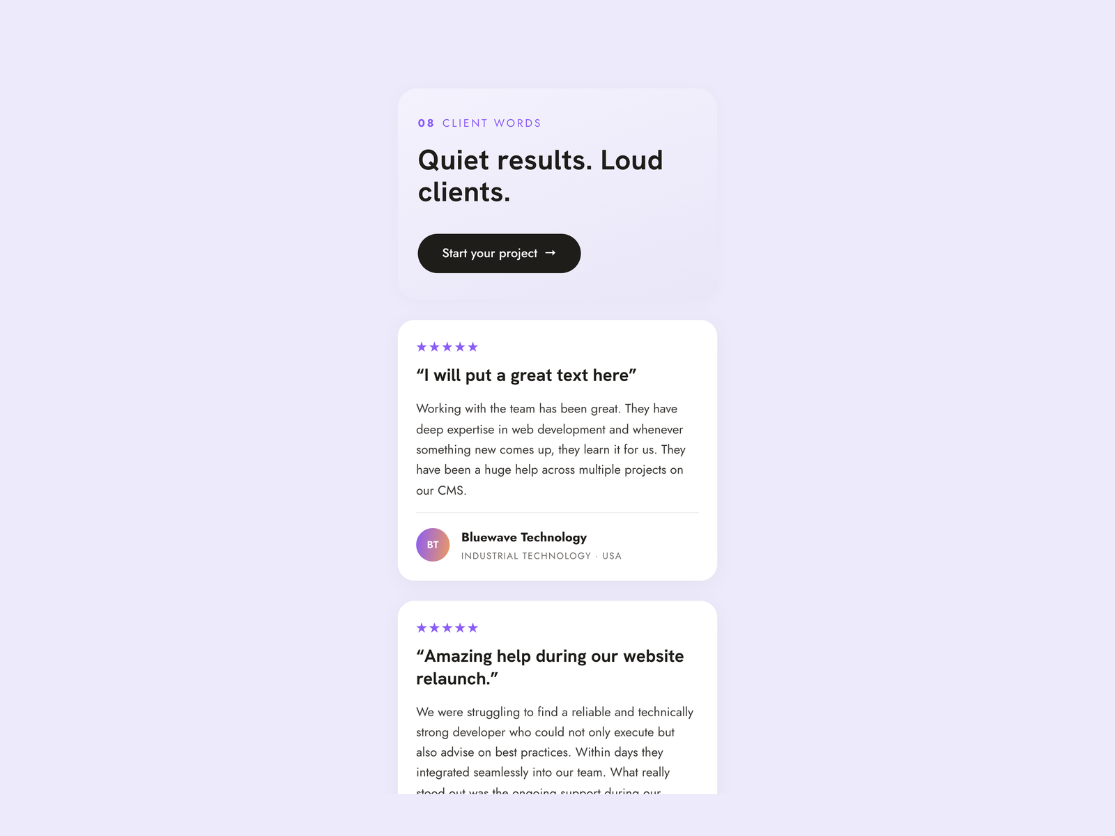
About Module
Total installs Fewer than 10 Created - Aug 28, 2026
Version 1 - Aug 28, 2026
Categories Tags
Requirements
HubSpot Subscription Works with all HubSpot plans

Contact .HUB
Legal Stuff
Please refer to the developer's Privacy Policy and Terms for more information.
Support
.HUB
- Варшава, Польща
Visit website
.HUB (formerly HubSpot Devs Club) is an official HubSpot Solutions Provider that has been working with HubSpot since 2016. We've supported 30+ clients across CMS development, CRM setup, automation, and custom HubSpot solutions — accumulating 16,000+ hours of hands-on platform experience. Behind every template we publish is a small, senior team that knows HubSpot inside out. We respond quickly, answer real questions (no overcomplicated tech talk), and treat each buyer as a long-term partner — not a one-time transaction.
