-1.png)
1/7 - This Module empowers you to create dynamic and engaging content within your HubSpot environment
Overview
The Customizable Text and Buttons | AW Module empowers you to create dynamic and engaging content within your HubSpot environment. This module offers flexibility by allowing you to add pre-heading, title, description, and call-to-action (CTA) elements seamlessly into your content.
Features
Pre Heading
Add a short, descriptive text element to introduce the main content or section. The preheader has two types: Type one is capitalized You can Change Preheader Font Color also Type two is uppercase You can Change Preheader Font Color also-1.png)
Title & Description
Title: Incorporate a headline to attract attention and highlight the primary message or topic. Description: Include detailed information or body text to provide context or additional insights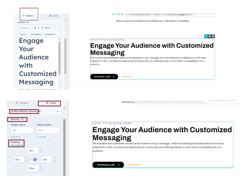
Buttons
Drive user interaction by adding a customizable CTA button, directing users to specific actions or destinations. It has two types: Primary Button Secondary Button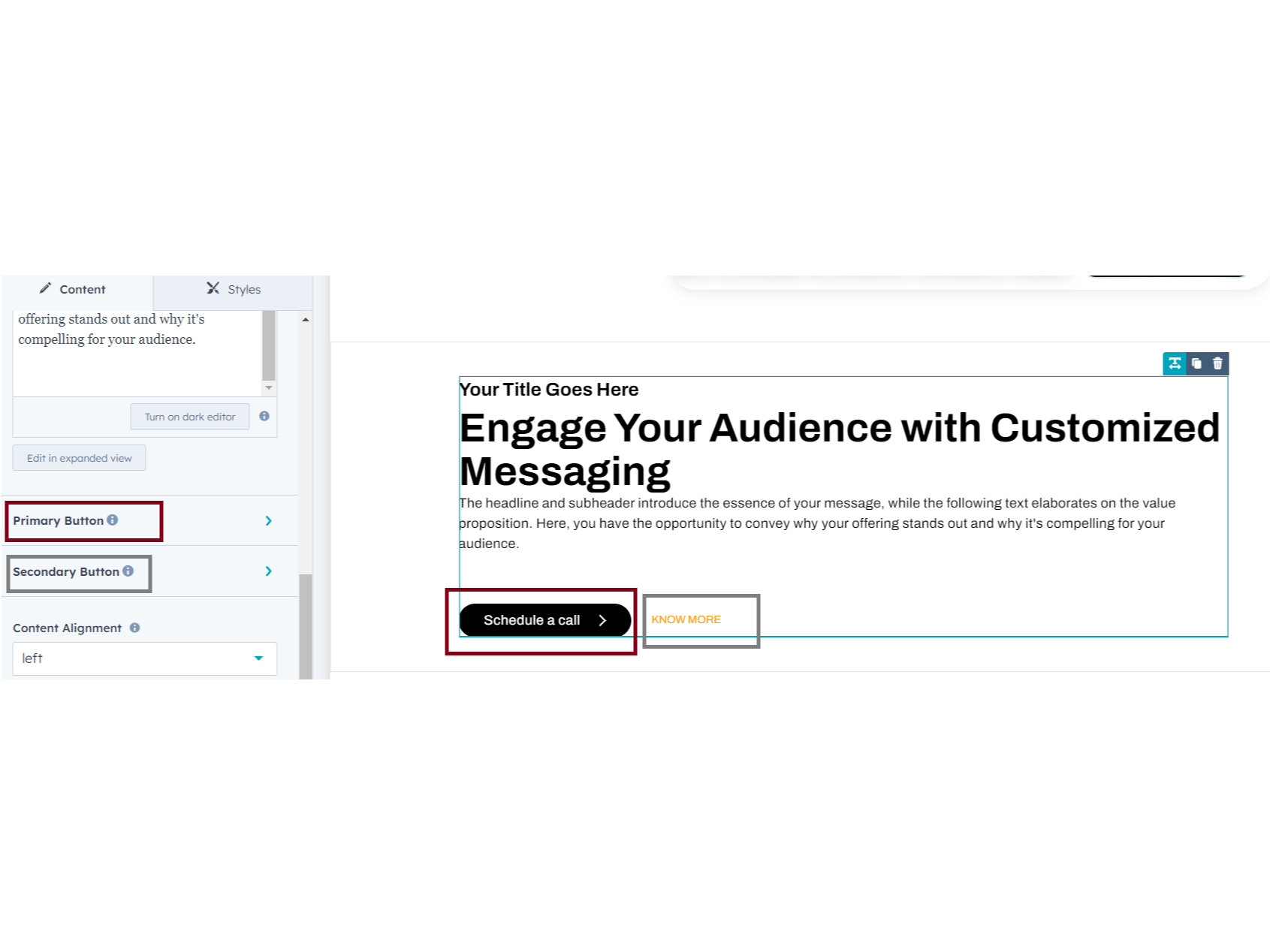
Primary Button
You can click the primary button; it has default 'primary Filled button' & 'Secondary text type button'. You can choose which type you want Primary Button: You can adjust Padding, Spacing, Background, Font color & Size, Border radius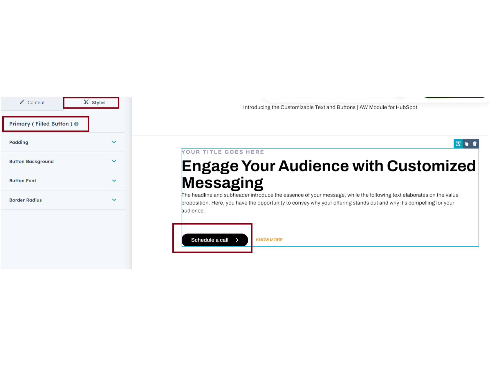
Secondary Button
Secondary Text button : You can adjust Font color, Size and text button hover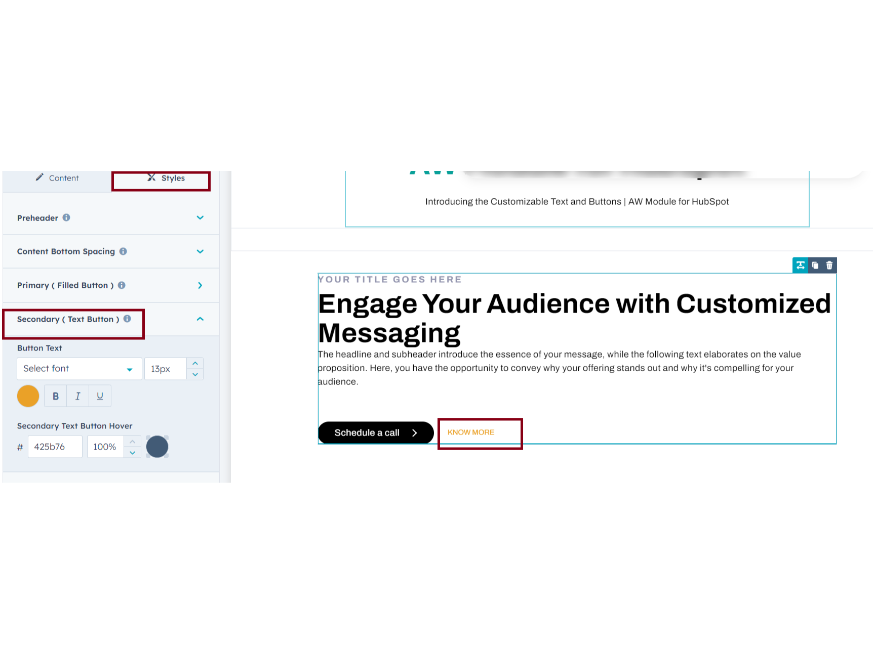
About Module
Total installs - 300+
Created - Apr 18, 2024
Version 1 - Apr 18, 2024
Categories Tags
Requirements
HubSpot Subscription Works with all HubSpot plans
Contact amwhiz media private limited
Legal Stuff
Please refer to the developer's Privacy Policy and Terms for more information.
Support
amwhiz media private limited
- chennai
Visit website
As your HubSpot Solution Partner, we aim to offer an irresistible blend of strategy, creativity, design, and technology to create a lasting standout digital solution for you that excites your target audience and drives conversion and business growth using HubSpot.
