
1/4
Overview
Module Description
A professionally designed, fully customizable comparison table module for HubSpot CMS that presents plans, products, or approaches side by side. One module covers three jobs — pricing tiers, a long feature matrix, and a head-to-head category comparison. On desktop it renders a real, semantic table; on phones every column becomes its own accordion, so a visitor reads one plan top to bottom instead of scrolling a grid sideways.
Key Features
Three Layouts, One Module
Pricing Tiers: Up to six plans with prices, badges, subtext, and a button per column
Feature Matrix: Long comparisons with the header row and feature column both pinned in place
Category Comparison: Qualitative, full-sentence cells for arguing approach rather than listing limits
Consistent Authoring: The same columns-and-rows fields drive all three, so you learn the module once
Search & Billing Toggle
Real-Time Search: Optional filtering by row label, tooltip text, and every cell value, with a 150ms debounce
Self-Tidying Categories: Category headings hide themselves once every row beneath them is filtered out
Billing Periods: Two prices per column switched by an iOS-style segmented control; columns whose prices match collapse to one
Announced Results: Match counts are spoken to screen readers, not just shown
Customizable Design
Complete Color Control: Surfaces, text, borders, accent, and the highlighted column tint
Light & Dark Palettes: Always light, always dark, or follow the visitor's device
Brand Inheritance: Accent colors inherit from your theme's primary and secondary colors
Full Control: Typography, spacing, row density, corner radii, border widths, and button styling
Swappable Icons & Editable Text
Five Replaceable Icons: Check mark, dash, info circle, chevron, and search magnifier
Built-In Fallbacks: Leave an icon field empty and the module's own inline SVG is used, inheriting your text color
Every String Is A Field: Including the ones only screen readers hear — so a brand that uses a different tick does not need a developer
Performance Optimized
Server-Side Rendering: All HTML rendered with HubL for instant visual content
No Layout Shift: Both views ship in the HTML and CSS chooses between them — nothing is assembled after load
Zero Dependencies: No CDN script, no icon font, no web font; the module reads nothing from the surrounding theme
Minimal JavaScript: Client-side code handles only the toggle, search, tooltips, and accordion slide
Mobile Responsive
Column Accordions: Below a width you choose (768, 880, or 1024px), each column becomes its own collapsible panel
Single Or Multi Open: One panel at a time, or several for side-by-side comparison
Tooltips Become Hints: Hover text drops inline under its row, since there is no hover on a phone
Accessibility Built In
Semantic Table: Proper
scopeon every header cell, plus a visually hidden caption you can editLabelled Marks: Check marks and dashes carry text alternatives instead of being skipped as decoration
Native Controls: A real fieldset of radios for billing, real
<details>accordions, and top-layer tooltips reachable by keyboardReduced Motion: The accordion slide respects
prefers-reduced-motion
Technical Specifications
CSS Namespacing: All classes use the
blk_prefix and all custom properties are namespaced--ctable-*, so the module never conflicts with theme styles or other modules.Browser Compatibility: Modern browsers (Chrome, Firefox, Safari, Edge), with progressive enhancement throughout — the Popover API falls back to a native
title, the Web Animations API falls back to an instant open, andbackdrop-filterfalls back to a solid background. With JavaScript disabled the table renders and scrolls, the accordions still open, and no content is hidden.Performance: Optimized for Core Web Vitals (LCP, INP, CLS). No client-side rendering, no template generation, and no external requests of any kind.
Use Cases
SaaS Pricing Pages: Plan tiers with a monthly/annual switch and a recommended plan
Feature Matrices: The long comparison page you link to from pricing
Service Packages & Membership Levels: Retainer or tier benefits side by side
Competitor Comparison: Argue approach rather than naming competitors, using prose cells
Product & Program Tiers: Model, specification, or course comparisons
Gotchas & Important Notes
Cells Match Columns By Position. Inside a feature row, cell values are matched to columns by their order, not by name. If you add a column later, add a cell to every feature row too — otherwise the new column renders blank. Reordering columns does not reorder cells.
Six Column Maximum. Beyond six, columns become too narrow to read and the comparison stops being useful.
Page Background Color Is Not The Module Background. It tints the frosted sticky bar so it blends with the page behind it — set it to match, or turn off Frosted Sticky Chrome.
Editor Translations Only. The bundled English and Spanish files localize field labels for editors. Visitor-facing text is translated the standard HubSpot way, through multi-language page variants.
Customization Services
Need it to do something it doesn't? Color, layout, spacing, icons, and every word on screen are already settings — you don't need us for those. Where teams usually do need us is past that line: more than six columns, a third billing period, rows built from HubDB or CRM data, or pricing pulled live from the system that owns it. A Design Link builds HubSpot modules for a living, and this one is ours.
Module Version: 1.0 Developer: A Design Link HubSpot Compatibility: CMS Hub (all tiers)
Features
Mobile Ready, Not just a Table.
On Mobile, every column becomes its own accordion: one plan, read top to bottom, ending in its own button. No pinch-zoom, no sideways scroll, no six columns crushed into an unreadable strip.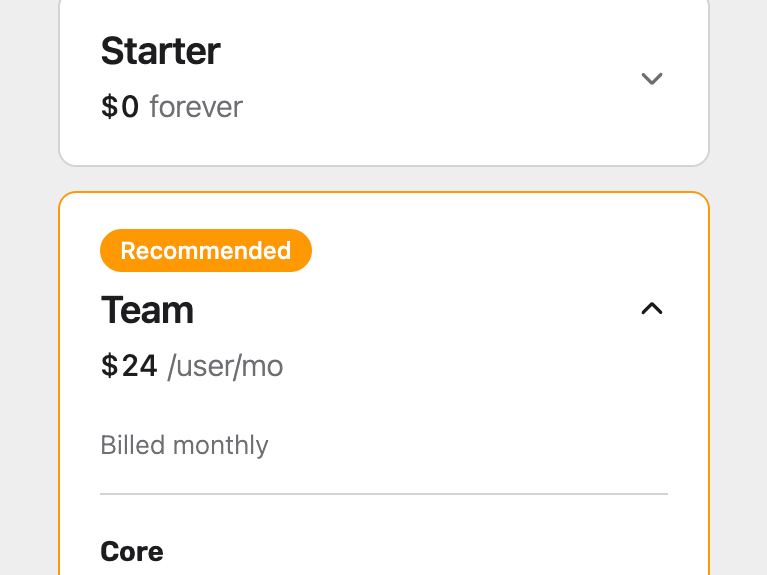
Nothing is hardcoded
Every icon can be replaced — the checkmark, the dash, the info circle, the chevron. Every visible string is a field, right down to the ones only screen readers hear. A brand that uses a different tick doesn't need a developer.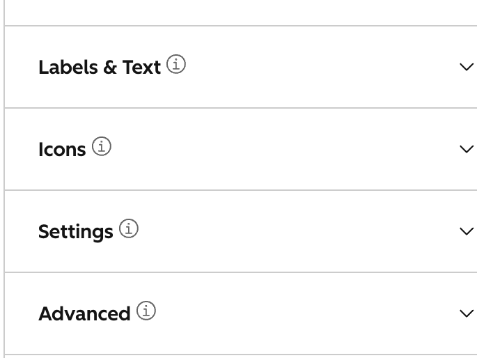
Readable by everyone
A real table with proper header scopes and a described caption, so a screen reader announces tha table purpose instead of reading a wall of disconnected values. Icons carry text alternatives. The mobile accordions are native elements that work with a keyboard, and reduced-motion preferences.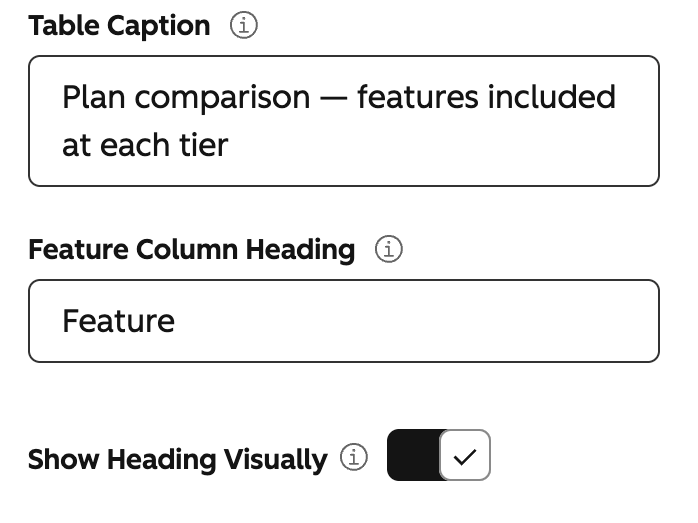
Fast because it does less
Everything renders on the server, so the finished table paints immediately and nothing shifts around as the page loads. No icon font, no CDN script, inherit your pages web font the module arrives with everything it needs and borrows what is needed from the theme around it.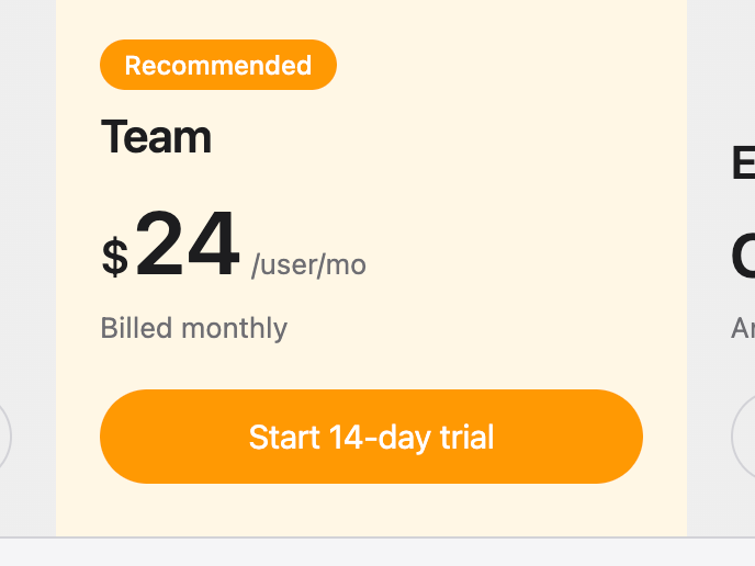
Find the row, skip the scroll
Optional search filters rows by their label, their tooltip, or any value inside them — and category headings tidy themselves away as they empty out. The match count is announced to screen readers, not just shown. Off by default, because a six-row pricing table doesn't need it.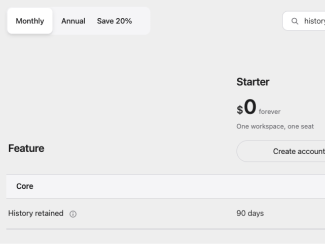
About Module
Total installs Fewer than 10 Created - Aug 14, 2026
Version 1 - Aug 14, 2026
Categories Tags
Requirements
HubSpot Subscription Works with all HubSpot plans
Contact A Design Link
Legal Stuff
Please refer to the developer's Privacy Policy and Terms for more information.
Support
A Design Link
- Tampa , FL
Visit website
Finding a great Hubspot Developer is super hard to find. That is where we come in. A Design Link has over 12+ years of HubSpot community experience. That translates to an amazing amount of knowledge when it comes to the Hubspot Marketing platform as-well-as designing and development on the Hubspot CMS plus everything in between!
Unlimited Email Support
A Design Link typically responds in
- Monday
10:00 AM - 4:00 PM (EST) - Tuesday
10:00 AM - 4:00 PM (EST) - Wednesday
10:00 AM - 4:00 PM (EST) - Thursday
10:00 AM - 4:00 PM (EST) - Friday
10:00 AM - 4:00 PM (EST)
