

1/3 - Better design using filters, layout, and pricing
Overview
Flexible Plan Selector is a dynamic pricing display tool that allows users to filter and view plans based on custom durations, apply automatic discounts, and control how many plans are displayed per row. With flexible feature lists, custom badges, icons, button styling, and responsive layouts, this module makes it easy to create clean and interactive pricing sections for any website.
Key Features:
Duration-Based Filtering: Filter pricing plans using a dropdown with custom duration values (e.g., 1, 12, 24).
Auto Discount Calculation: Enter a base price and discount percentage to automatically calculate the final pricing.
Custom Plan Layouts: Choose to display 2, 3, or 4 plans per row for flexible layout control.
Grouped Feature Lists: Organize plan features under custom headings with individual feature icons and tick items.
Feature Tags & Badges: Add inline icons and customizable tags to highlight features such as Pro, Premium, New, or Popular.
Independent Tip Colours: Customize tip text and background colours independently for each pricing plan.
Custom Button Styling: Control button text, background, and border colours individually for each plan.
Responsive & Clean UI: Mobile-friendly, grid-based display ensures a clean and consistent experience across all screen sizes.
Flexible Design Controls: Customize colors and other available styling options to match your website branding.
Features
Duration-Based Plan Filtering
Let visitors filter pricing plans by duration to quickly find the options that match their preferred subscription period.
Auto Price Calculation
Enter the price and discount to automatically calculate the final amount.
Select number of plans per row
Choose how many plans to display in each row: 2, 3, or 4 options.
Flexible Feature Items
Add custom feature items with icons, text, tags, and grouped headings for each plan.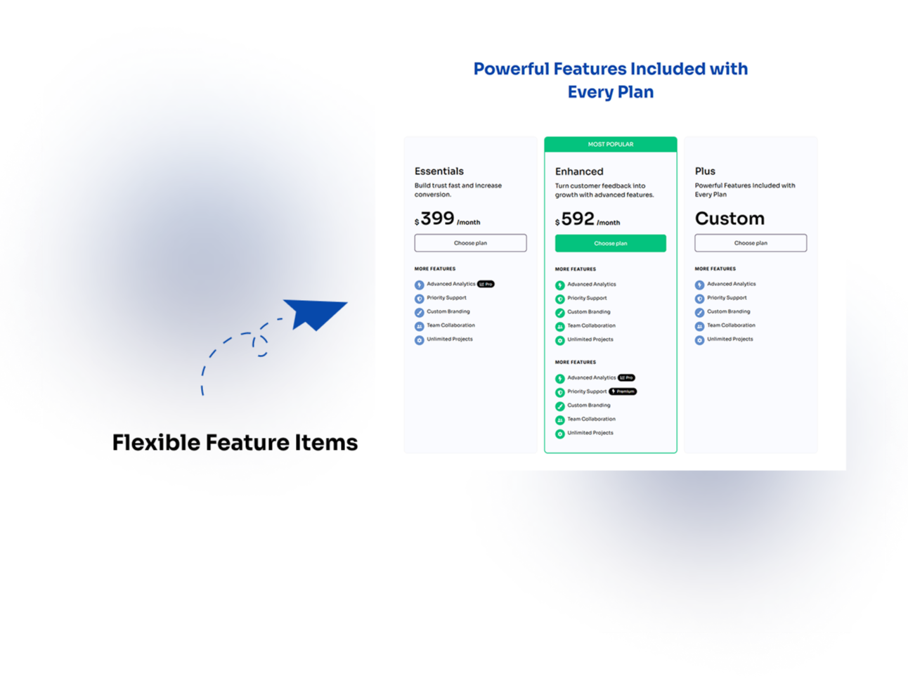
Fully Responsive Design
The module is optimized for all devices, ensuring a seamless experience on desktops, tablets, and smartphones.
About Module
Total installs Fewer than 10 Created - Jun 18, 2025
Version 6 - Sep 29, 2026
Categories Tags
Requirements
HubSpot Subscription Works with all HubSpot plans
Contact Modfrybus
Legal Stuff
Please refer to the developer's Privacy Policy and Terms for more information.
Support
Modfrybus
- India
Visit website
Modfrybus is specialize in HubSpot web design and development. We craft sleek, custom themes and offer easy-to-use modules. Our friendly support is always here to help you bring your ideas to life.
No-Cost Bug Fixes
Unlimited Email Support
Modfrybus typically responds in
- Monday
11:00 AM - 6:00 PM (IST) - Tuesday
11:00 AM - 6:00 PM (IST) - Wednesday
11:00 AM - 6:00 PM (IST) - Thursday
11:00 AM - 6:00 PM (IST) - Friday
11:00 AM - 6:00 PM (IST)
