
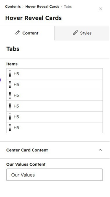
1/2 - Repeater-based structure for adding multiple service cards Each card can be customized independently
Overview
The Hover Info Cards module is a dynamic, interactive content block that lets you showcase up to 6 key features, values, services, or benefits in an engaging card-based layout. On desktop, hovering over a card smoothly reveals expanded details in a dedicated content area — keeping the page clean while giving visitors rich information on demand. On tablet and mobile, the same content opens in an accessible slide-up modal, ensuring a seamless experience across all devices.
Key features:
Interactive hover reveal – Desktop visitors hover (or use keyboard navigation) over a card to instantly reveal expanded content with a smooth fade-and-slide animation, without leaving the page.
Mobile-friendly modal – On smaller screens, tapping a card opens a focus-trapped, accessible bottom-sheet modal with the same expanded content.
Flexible icons – Choose between custom images or inline SVG icons for each card, with full control over size, background color, and border radius.
Eye-catching center highlight card – A dedicated center card with gradient text, custom border, and layered shadow effects draws attention to your core message or tagline.
Fully customizable styling – Control backgrounds (image, color, or gradient), spacing, card colors/hover states, button styles, and content colors — all from the drag-and-drop editor, no code required.
Built-in CTA button – Add a call-to-action button with optional HubSpot or custom SVG icons, multiple style and size options.
Accessibility-first – Full keyboard navigation, ARIA roles/labels, focus management, and screen-reader-friendly markup.
SEO-ready – Optional structured data (JSON-LD ItemList schema) toggle to help search engines understand your content.
Responsive by design – Optimized layouts for desktop (3-column grid with hover expand), tablet, and mobile (modal-based), with smooth breakpoint transitions.
Perfect for highlighting company values, service offerings, team principles, or product features in a visually engaging, space-efficient way.
Features
Interactive Hover-Reveal Cards with Mobile-Friendly Modal
Hover over any card on desktop to instantly reveal expanded details with a smooth fade animation — no page reload needed. On tablet and mobile, the same content opens in an accessible, focus-trapped slide-up modal, ensuring an engaging experience across every device and screen size.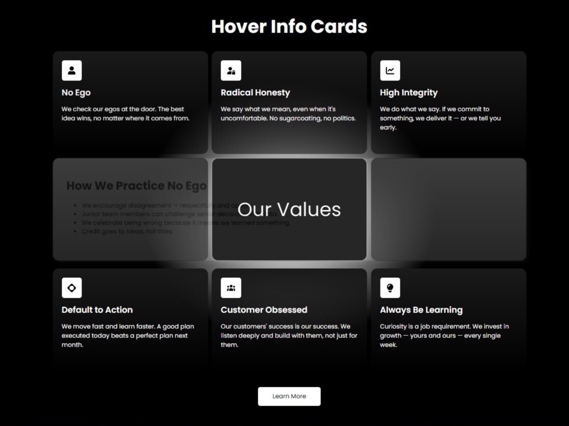
Fully Customizable Design with Icons, Colors & SEO Schema
Customize backgrounds, card colors, spacing, icons (image or SVG), borders, and CTA buttons directly in the editor — no code required. Includes built-in accessibility (ARIA, keyboard nav) and an optional JSON-LD schema toggle to boost SEO with rich, structured search results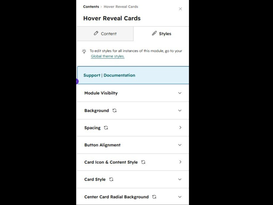
About Module
Total installs Fewer than 10 Created - Jun 15, 2026
Version 1 - Jun 15, 2026
Categories
Requirements
HubSpot Subscription Works with all HubSpot plans





Contact Phar
Legal Stuff
Please refer to the developer's Privacy Policy and Terms for more information.
Support
Phar
- India
Visit website
We provide end-to-end HubSpot services across both CRM and CMS. Our team helps businesses set up, customize, and optimize HubSpot to streamline operations, improve customer experiences, and drive growth. From CRM implementation and automation to CMS development and ongoing support, we deliver reliable solutions tailored to your business needs.
uniquedeveloper84@gmail.com
Phar typically responds in
- Monday
8:00 AM - 10:00 PM (IST) - Tuesday
8:00 AM - 10:00 PM (IST) - Wednesday
8:00 AM - 10:00 PM (IST) - Thursday
8:00 AM - 10:00 PM (IST) - Friday
8:00 AM - 10:00 PM (IST)