1/5 - Full page demo preview image
Overview
"IconService Cards" Modules are visual design elements commonly used in web development and design systems. These modules combine icons with short text descriptions, a button to highlight features, services, or categories in a compact and visually appealing way. They're typically used to grab attention, improve user engagement, and help users quickly understand key concepts or navigate through a website. It's easy, mobile-friendly and the special thing about this module is that you can set it according to your design and requirements.
Here are key features:
1) Cards Layouts
2) Interactive Elements
3) Grid and Column Layouts
4) Limitless Customization
5) Multiple Hover Effect
6) Link on Full Boxes
IconService Cards Modules offer a wide range of customizable features that make them suitable for a variety of use cases, from simple feature highlights to complex, dynamic content presentations. Their flexibility in design, layout, and interactivity ensures they can meet the needs of different websites and platforms, while remaining visually engaging and user-friendly.
Features
Easy To Use
Simple and intuitive to operate or understand.
Multiple Cards Layouts [Ex. Fancy Cards, Left Icon, Right Icon.. etc ]
Multiple card layouts options are provided in this module. Such as "Basic", "Left side icon", "Right side icon", "Zig-zag Up first", "Zig-zag Down first", "Steps Up", "Steps Down", "Bordered (All border, Top border and Bottom border)", "Transition effect box (Top transition and Tilt 3d effect)" etc.![Multiple Cards Layouts [Ex. Fancy Cards, Left Icon, Right Icon.. etc ]](https://22360598.fs1.hubspotusercontent-na1.net/hubfs/22360598/__hs-marketplace__/Feature-IS-02-1.png)
Limitless Customization
Endless customization possibilities for design, allowing users to tailor the interface to their preferences without constraints. Offers flexibility to customize according to the specific needs and requirements of the project or workflow.
Link on Full Boxes
You can set the link to the entire card using this field. When enabled, the link field will appear in the icon box items repeater group.
Boxes Hover Effect (Tilt 3D Effect & Transition Top)
You can set the card hover effect like "Transition top", "Tilt 3D effect"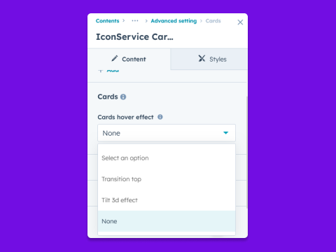
About Module
Total installs - 10+
Created - Oct 1, 2024
Version 2 - Mar 5, 2025
Categories Tags
Requirements
HubSpot Subscription Works with all HubSpot plans
Contact GAN Creative
Legal Stuff
Please refer to the developer's Privacy Policy and Terms for more information.
Support
GAN Creative
- Ahmedabad, India
Visit website
GAN Creative building state-of-the-art, easy to use, user-friendly websites and applications is truly excellent development of new HubSpot CMS. Our services and solutions include: Scratch theme development, Existing Theme Customize, Responsive Redesign, Website Customize, Redesign Website, Landing Pages, Web Pages, New Module, Module Customize, Hub DB, Custom Object, Local Development, Blog Listing and Blog Post, System Pages, Email Templates Development and Problem-solving ability. In our development, you don't need any coding skills. Our aim to provide creative tools to make your job easier, less stressful, and you will enjoy our services and solutions with lower cost and better efficiency.