
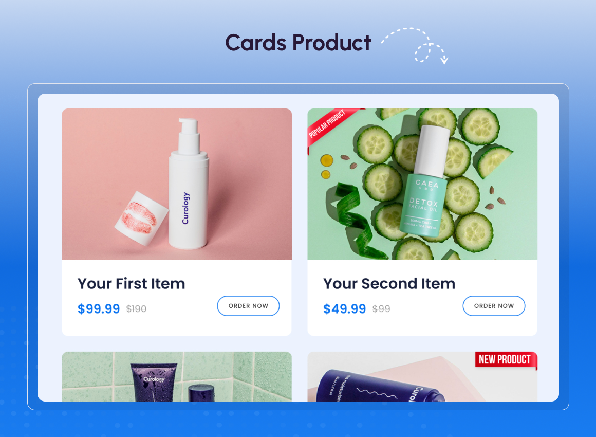
1/3 - Showcase your multiple products in elegant cards.
Overview
The Multipurpose Content Cards module is built to help you present information in a clean, structured, and visually engaging way across your HubSpot CMS pages. It enables you to highlight services, features, or key messages using a unified card-based layout.
This module supports multiple display styles, including grid and slider layouts, allowing you to adapt content presentation based on page goals. Advanced options like badges, flip interactions, and RTL slider direction give you greater flexibility without increasing design complexity.
By consolidating multiple use cases into one powerful module, it reduces module duplication, improves page performance, and maintains strong brand consistency across the website.
How does this help your business?
It improves content clarity, maintains brand consistency, speeds up page performance, and enhances user engagement helping you communicate more effectively and convert better.
Key features:
Reusable Card Structure – Use a single card module to showcase services, features, or products while maintaining consistent design across your website.
Multiple Layout Options – Switch between different layouts to match page goals without recreating or redesigning content.
Grid Layout – Display cards in a structured grid for clear comparison and organised presentation across devices.
Slider / Carousel Layout (LTR & RTL) – Showcase more content in limited space with smooth carousel navigation supporting both LTR and RTL directions.
Fully CMS-Editable Content – Edit images, text, CTAs, and badges directly in HubSpot CMS without developer support.
Conditional Rendering – Show or hide specific card elements to keep layouts clean and content-focused.
Responsive by Default – Automatically adapts layouts for desktop, tablet, and mobile screens for consistent user experience.
Lightweight & Performance-Friendly – Built with vanilla JavaScript to ensure faster load times and better page performance.
Design System Friendly – Easily align cards with your brand’s typography, colours, and spacing guidelines.
Advanced Features – Enhance interaction with slider controls, equal-height cards, hover effects, and flexible CTA behaviour.
Structured Multi-Card Architecture – Manage, duplicate, and reorder multiple cards within a single module while keeping design integrity intact.
Flexible Display Modes (Grid & Carousel) – Change display styles instantly to suit content volume and layout needs.
Auto-Balanced Card Heights – Maintain visual balance with cards that automatically align to equal heights.
Dynamic Element Visibility Controls – Control the visibility of images, text, and buttons to reduce clutter and improve clarity.
Comprehensive Design Customisation – Customise typography, spacing, colours, and styles without writing custom code.
User-Friendly Interface – Simple and intuitive controls designed for marketers to manage content effortlessly.
Adaptive Layout for All Screen Sizes – Ensures readability and visual consistency across all screen resolutions.
Features
Reusable Card Structure
This feature allows you to manage multiple cards within a single module while keeping content structured and consistent. Cards can be added, duplicated, or reordered easily from the CMS editor. It helps maintain design integrity across services, features, and product sections.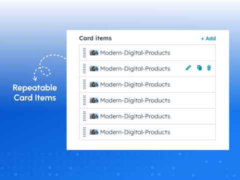
Flexible Display Modes
You can switch between grid and carousel layouts without changing or rebuilding content. This flexibility lets you adapt the presentation based on page layout and content volume. It is ideal for both information-heavy sections and compact visual highlights.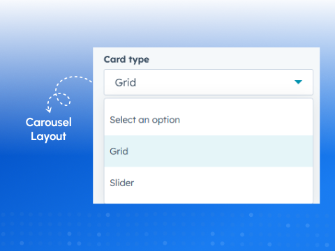
Auto-Balanced Card Heights
Cards automatically adjust to the same height regardless of content length. This creates a clean and professional layout with perfect visual alignment. It ensures better readability and a consistent browsing experience.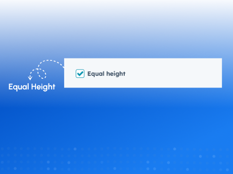
Dynamic Element Visibility Controls
Individual card elements such as images, text, and buttons can be shown or hidden as needed. This allows each card to display only relevant information. It keeps layouts clean and avoids unnecessary visual clutter.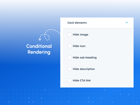
Comprehensive Design Customization
The module offers full control over typography, spacing, colours, and visual styles. These settings help align the cards with your brand design system. You can achieve a polished and consistent look without custom code.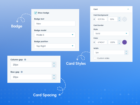
About Module
Total installs Fewer than 10 Created - Feb 27, 2026
Version 1 - Feb 27, 2026
Categories Tags
Requirements
HubSpot Subscription Works with all HubSpot plans




Contact Syngrid Technologies
Legal Stuff
Please refer to the developer's Privacy Policy and Terms for more information.
Support
Syngrid Technologies
- Singapore
Visit website
Syngrid is a Singapore-based IT solutions provider specializing in web and mobile development, digital transformation, and cloud-based business automation. As a trusted Zoho partner and experts in HubSpot, we help organizations streamline operations, enhance productivity, and drive growth through innovative technology solutions.
Unlimited Email Support
Syngrid Technologies typically responds in
- Sunday
8:30 AM - 1:30 PM (+08) - Monday
8:30 AM - 5:30 PM (+08) - Tuesday
8:30 AM - 5:30 PM (+08) - Wednesday
8:30 AM - 5:30 PM (+08) - Thursday
8:30 AM - 5:30 PM (+08) - Friday
8:30 AM - 5:30 PM (+08) - Saturday
8:30 AM - 1:30 PM (+08)
