
1/7
Overview
Popup & Modal Pro puts popups on your HubSpot pages without a developer or a separate popup tool. Drop the module into a page and it becomes one popup: a welcome offer after a few seconds, a sign-up when a visitor heads for the tab bar, a webinar recording that plays over the page, a launch that takes the whole screen. Content, triggers, rules and every word on screen are fields in the page editor.
A popup opens by a click or on its own. Any link to #your-popup-id opens it, from rich text, a menu or another module's button. So does any element matching a CSS selector you enter, or the module's own trigger button, placed where the module sits or floating in a corner. It can also open after a delay, after a set time spent reading, at a scroll depth or when a chosen section comes into view, on exit intent, after a quiet spell with no input, or from a URL parameter such as ?popup=spring, so an email or an ad can land a visitor on the page with the offer already open.
Choose the layout: a centred modal, a split panel with an image on either side, a full-screen takeover, a slide-in from any corner, a bar at the top or bottom of the page, a side drawer, or a video lightbox. On phones a modal, split, drawer or video can become a bottom sheet the visitor swipes away. Inside the popup go an icon or an image, an eyebrow, a heading, text, a HubSpot form, buttons, a coupon code with a Copy button, a countdown and a "No thanks" link.
Automatic showings follow the rules you set: every page view, once per visit, once every so many days or once ever, a cap on the total, and nothing more after the visitor signs up, clicks your button or copies the code. Target desktop or phones, new or returning visitors, and wait for a set number of page views or seconds into the visit. A click always opens the popup, whatever the rules say, because the visitor asked for it. Place several on one page, or in a global group, and they form a queue: one popup on screen at a time, ordered by the priority you give each.
Every colour, size, spacing, radius, shadow and animation is a field on the Style tab, and every interface string is a field on the Content tab, so the popup can be restyled and translated in full. The accent colour and both fonts come from your theme settings. In the page editor the popup shows open and in place, so you edit what visitors will see, and it never covers the editor or locks its scroll.
Features
Opened by a click, a scroll, a delay or an exit
Any #link to the popup, a CSS selector, its own button or a URL parameter opens it on request. On its own it can open after a delay, at a scroll depth, when a section arrives, on exit intent or after a quiet spell with no input.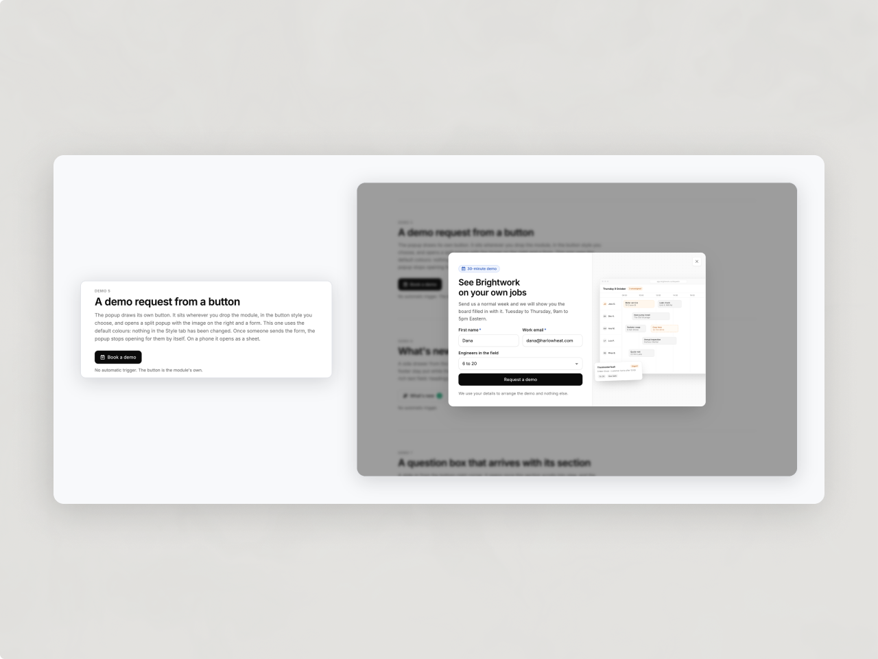
Shown as often as you choose
Every visit, every few days or once, capped, and never again after a sign-up, a button click or a copied code. Target phones or desktop, new or returning visitors. Several popups on a page queue up, so only one is ever on screen, and a click always opens.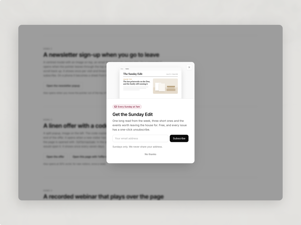
Built, styled and translated in the editor
Modal, split, full screen, slide-in, bar, drawer or video lightbox. Every colour, size and animation is a Style field, fonts and accent come from your theme, and every string is a field. In the editor it shows open and in place.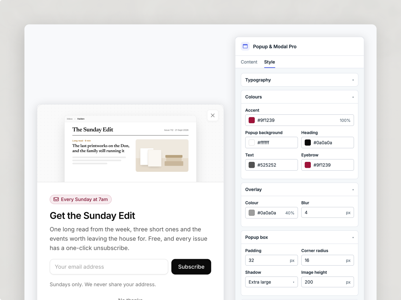
About Module
Total installs Fewer than 10 Created - Sep 29, 2026
Version 1 - Sep 29, 2026
Categories Tags
Requirements
HubSpot Subscription Works with all HubSpot plans
Contact Studio Nope
Legal Stuff
Please refer to the developer's Privacy Policy and Terms for more information.
Support
Studio Nope
- Romania
Visit website
Studio Nope designs and builds fast, clean HubSpot CMS websites and custom themes for teams that care about performance, editing experience, and reliable tracking.
Unlimited email support
Studio Nope typically responds in
- Monday
9:00 AM - 5:00 PM (EET) - Tuesday
9:00 AM - 5:00 PM (EET) - Wednesday
9:00 AM - 5:00 PM (EET) - Thursday
9:00 AM - 5:00 PM (EET) - Friday
9:00 AM - 5:00 PM (EET)