
-1.png)
1/4 - Build flexible mega menus with organized navigation and engaging content.
Overview
Create a modern, organized, and fully responsive website navigation without writing a single line of code. The Smart Mega Menu module helps you build everything from simple dropdown menus to advanced multi-column mega menus directly inside HubSpot's visual editor.
Whether you're creating a business website, SaaS platform, eCommerce store, agency website, or corporate portal, this module gives you complete control over your navigation. Easily display navigation links, featured content, promotional sections, and nested menus in a clean, user-friendly layout that works perfectly across desktop, tablet, and mobile devices.
The module supports flexible mega menu layouts with 2 to 4 columns, allowing you to organize large amounts of content in a structured way. You can add featured content, promo boxes, multiple navigation groups, and dropdown panels to create an engaging browsing experience.
Need a cleaner header? Simply enable or disable the built-in search bar and CTA buttons with a single toggle. Customize colors, backgrounds, typography, spacing, borders, hover effects, and much more to match your brand without touching code.
With support for unlimited menu items, multi-level nested submenus, responsive layouts, and extensive styling controls, the Smart Mega Menu module is designed to grow with your website. Whether your navigation contains a few links or hundreds of pages, it remains easy to manage and visually organized.
Built specifically for HubSpot, the module integrates seamlessly with the drag-and-drop editor, making it simple for marketers, designers, and developers to create professional navigation experiences in minutes.
Key Features:
Fully responsive mega menu for desktop, tablet, and mobile.
Create multi-column mega menu layouts (2–4 columns).
Build unlimited dropdown menus and nested submenus.
Add featured content sections inside mega menu panels.
Include customizable promo boxes to highlight products, services, or offers.
Built-in search bar with show/hide option.
Two customizable CTA buttons with independent visibility controls.
Logo support for complete header navigation.
Light mode and dark mode support.
Built-in Multi-Language Switcher.
Unlimited color customization for backgrounds, text, links, buttons, and hover states.
Customize typography, spacing, borders, and layout settings.
Smooth dropdown and mega menu animations.
Organize large navigation structures with ease.
No coding required—everything is managed through the visual editor.
Compatible with HubSpot's drag-and-drop page editor.
Easy to configure and maintain.
Clean, modern, and performance-focused design.
Suitable for business, SaaS, agency, eCommerce, portfolio, and corporate websites.
Features
Flexible Multi-Column Menus
Design responsive mega menus with multiple columns, featured content, and promotional boxes.-2-1.png)
Create Rich Mega Menu Panels
Create organized mega menu panels with links, icons, featured sections, and promo content.-1.png)
Custom Header & Navigation
Build a professional header with customizable navigation, search, logo, and CTA button options.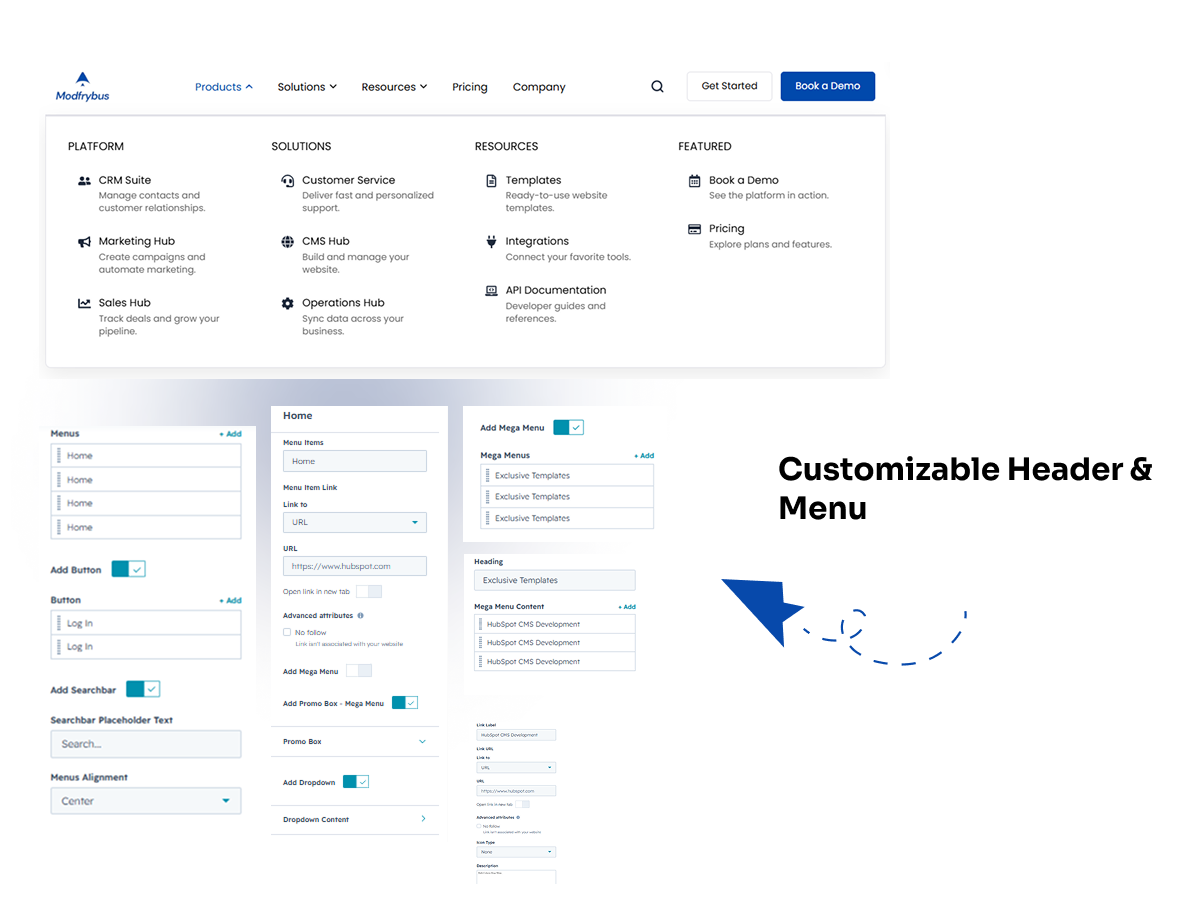
HubSpot or Custom Icon Options
Choose a HubSpot icon, use a custom icon, or display menu items with text only.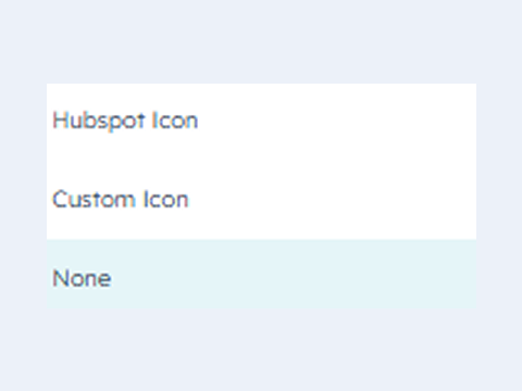
Fully Responsive Design
The module is optimized for all devices, ensuring a seamless experience on desktops, tablets, and smartphones.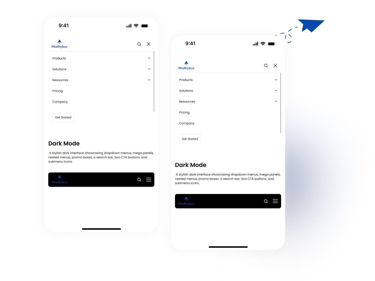
About Module
Total installs Fewer than 10 Created - Jul 8, 2026
Version 2 - Jul 10, 2026
Categories Tags
Requirements
HubSpot Subscription
Contact Modfrybus
Legal Stuff
Please refer to the developer's Privacy Policy and Terms for more information.
Support
Modfrybus
- India
Visit website
Modfrybus is specialize in HubSpot web design and development. We craft sleek, custom themes and offer easy-to-use modules. Our friendly support is always here to help you bring your ideas to life.
No-Cost Bug Fixes
Unlimited Email Support
Modfrybus typically responds in
- Monday
11:00 AM - 6:00 PM (IST) - Tuesday
11:00 AM - 6:00 PM (IST) - Wednesday
11:00 AM - 6:00 PM (IST) - Thursday
11:00 AM - 6:00 PM (IST) - Friday
11:00 AM - 6:00 PM (IST)
