1/2 - Module config
Overview
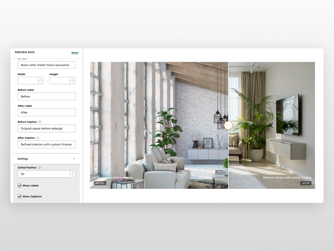
A drag-to-compare image slider that lets visitors reveal differences between two images by dragging a handle across the frame. Before After Pro is perfect for showcasing renovations, retouching, product changes, or any visual transformation — fully customizable from the editor.
Every element is configurable from the Style tab: container width, aspect ratio (5 presets from 16:9 to 21:9 ultrawide), border radius, box shadow, divider line (color, width, shadow), handle (background, icon color, border color, size), labels (text color, background, font size, border radius, padding), captions (text color, font size), and responsive breakpoints. 26+ style fields in total.
What you can build:
Before/after renovation showcases
Photo retouching comparisons
Product upgrade demonstrations
Design iteration comparisons
Seasonal or temporal change displays
Content features: Before and after images with alt text. Configurable labels ("Before" / "After") with show/hide toggle. Optional captions for additional context. Adjustable initial slider position (10-90%).
Interaction: Drag handle with mouse or touch to reveal. Smooth clip-path based transition. Works on desktop and mobile. Responsive handle and label sizing.
Style tab: Container (max width, horizontal padding), image (aspect ratio, border radius, min/max height, box shadow), divider & handle (divider color/width/shadow, handle background/icon color/border color/size), labels (text color, background color with opacity, font size, border radius, padding), captions (text color, font size), spacing (padding top/bottom), responsive (tablet/mobile breakpoints). Handle colors inherit from HubSpot theme settings.
Works on any HubSpot template, no theme required.
Features
Smooth Drag-to-Compare
Clip-path based image reveal with fluid mouse and touch interaction. Configurable initial position, responsive handle sizing, and custom divider styling. Works seamlessly on desktop and mobile.
5 Aspect Ratio Presets
Choose from 16:9 (Widescreen), 4:3 (Standard), 3:2 (Landscape), 1:1 (Square), or 21:9 (Ultrawide). Plus min/max height controls and 5 box shadow presets for the perfect frame.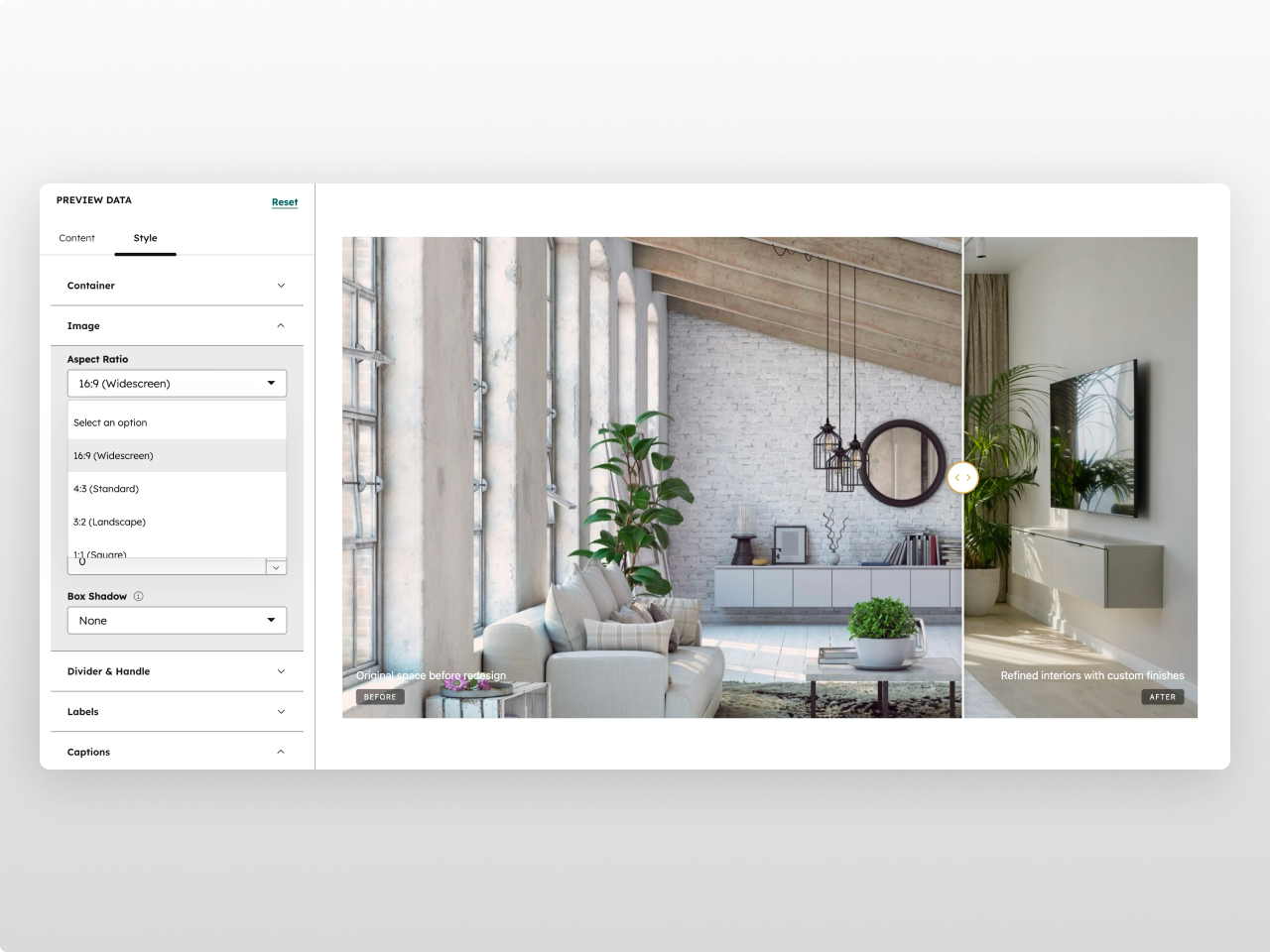
26+ Style Controls
Full design control over the divider line, circular handle (background, icon, border), labels, captions, border radius, shadows, and responsive breakpoints. Brand colors inherit from your HubSpot theme.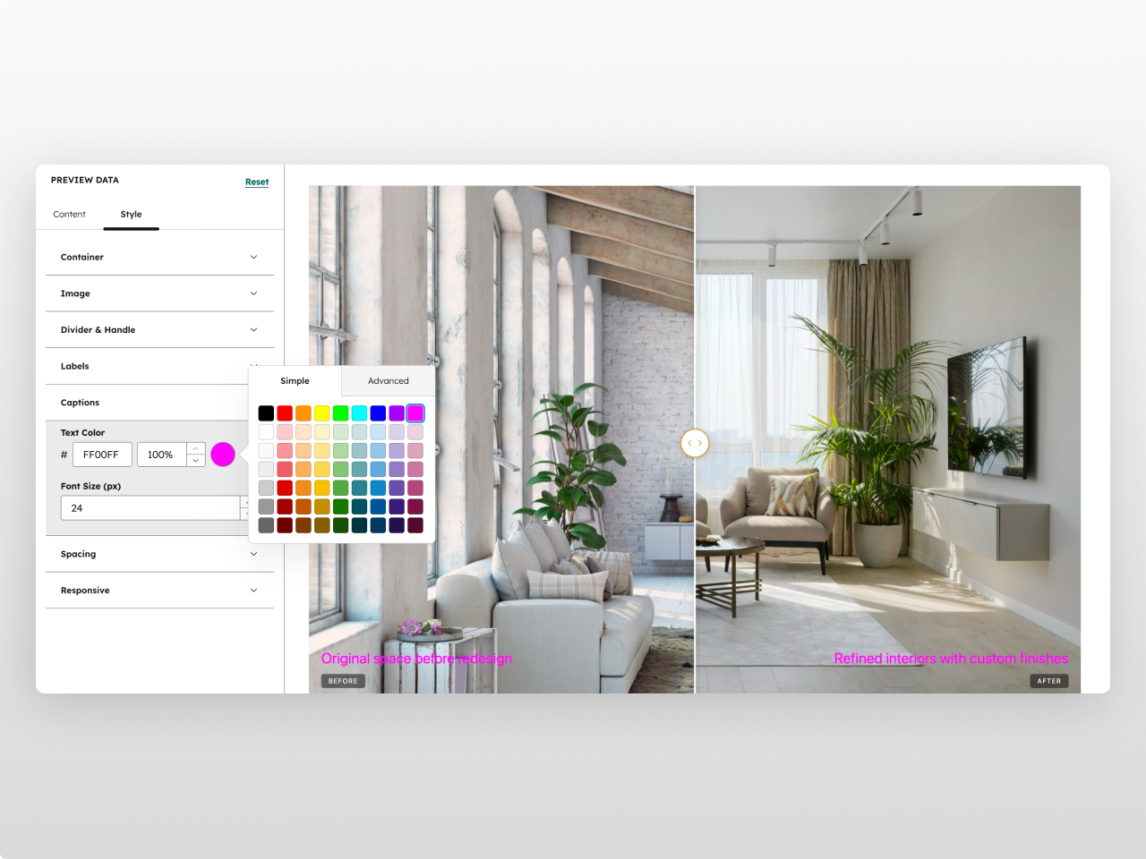
About Module
Total installs Fewer than 10 Created - Feb 23, 2026
Version 1 - Feb 23, 2026
Categories Tags
Requirements
HubSpot Subscription Works with all HubSpot plans
Contact Studio Nope
Legal Stuff
Please refer to the developer's Privacy Policy and Terms for more information.
Support
Studio Nope
- Romania
Visit website
Studio Nope designs and builds fast, clean HubSpot CMS websites and custom themes for teams that care about performance, editing experience, and reliable tracking.
Unlimited email support
Studio Nope typically responds in
- Monday
9:00 AM - 5:00 PM (EET) - Tuesday
9:00 AM - 5:00 PM (EET) - Wednesday
9:00 AM - 5:00 PM (EET) - Thursday
9:00 AM - 5:00 PM (EET) - Friday
9:00 AM - 5:00 PM (EET)