
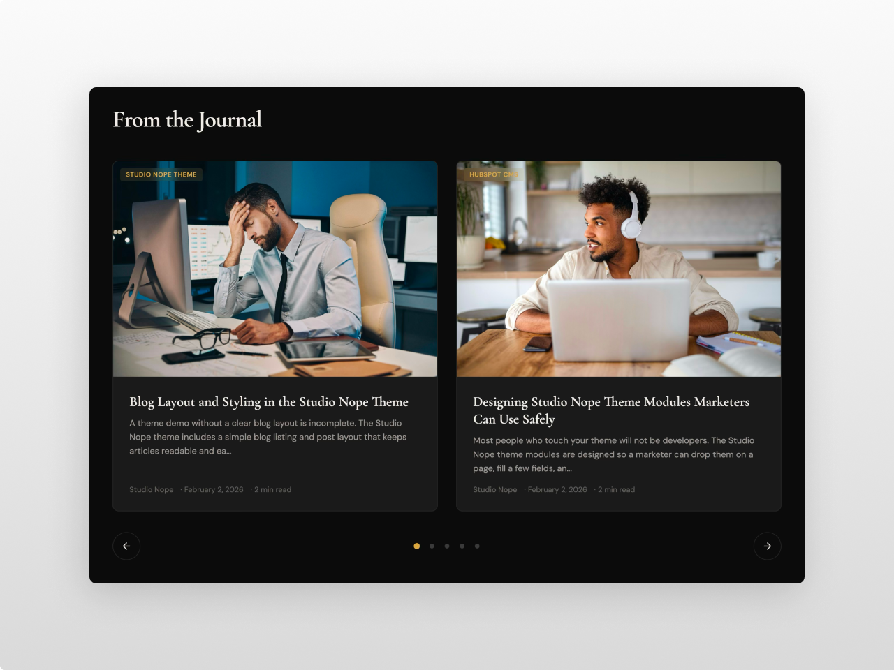
1/3 - Wide 2-column carousel on dark background.
Overview
A premium blog module that pulls posts dynamically from any HubSpot blog into three responsive layouts: carousel, grid, or featured bento. Everything is managed from the visual editor.
Blog Carousel Pro gives you a Swiper-powered slider with autoplay and pagination, a CSS grid with optional Load More button, and a featured bento layout where a large hero card sits beside evenly stacked thumbnails. Pick a blog, set the post count, filter by tag, and style everything from the Style tab.
Every element is fully customizable. Section backgrounds can be solid or transparent for full-width color bands. Card backgrounds, borders, shadows with four intensity levels, and image hover effects (zoom, brighten, darken) are all configurable. Typography uses two Google Font pickers. Tag badge colors, navigation arrows and dots, CTA links, and Load More button styling each have their own controls. 50+ style fields in total.
What you can build:
Editorial carousels with serif headings, gold accents, and image zoom on hover
Dark magazine sliders with autoplay and reading time badges
Clean resource grids with Load More pagination and colored tag badges
Compact 4-column insight grids on dark navy or teal backgrounds
Featured article layouts with a large hero card and thumbnail sidebar
Minimal text-only post lists with inline tags and long excerpts
Full-width dark sections with centered content containers for landing pages
Content features include pulling 2 to 20 posts from any blog with tag filtering (case-insensitive) and current post exclusion for blog templates. Cards support featured images at five aspect ratios (16:9, 4:3, 3:2, square, auto), tag badges that overlay on images or display inline, configurable excerpts (50 to 300 chars), author name with optional photo, four date formats (short, long, relative, numeric), and estimated reading time. Every card element toggles independently.
Carousel mode offers 2 to 4 columns with optional autoplay (2 to 10 seconds), loop, arrows, and dots. Grid mode offers 2 to 4 columns with optional Load More where you set the initial count. Featured mode uses an equal-height bento grid with a large card on the left and a thumbnail strip on the right. Separate tablet and mobile breakpoints let you control the esponsive behavior. Full-width section backgrounds with centered content containers work through independent max-width and padding controls.
The Style tab includes 50+ fields organized into clear groups. Section background with opacity. Container max-width and padding. 19 color fields covering cards, text, tags, arrows, dots, CTA, and Load More. Two Google Font pickers with theme inheritance. Font sizes for heading, title, excerpt, meta, and tags. Card border radius, image radius, shadow, hover shadow, hover effect, content padding, and border. Arrow size, dot size, dot gap, and navigation margin. Section padding top and bottom with heading spacing. Tablet and mobile breakpoints.
Hover transitions are GPU-composited for smooth performance. Swiper loads from CDN only when carousel mode is active. All CSS is scoped per instance so multiple modules work on the same page with zero conflicts. Semantic HTML, ARIA labels, and lazy loading are built in. Works on any HubSpot template with no theme required.
Features
Three Responsive Layouts
Swiper carousel with autoplay, arrows, and pagination dots. CSS grid with optional Load More button. Featured bento grid with equal-height columns: hero card on the left, stacked thumbnails on the right. All modes support 2 to 4 columns and collapse cleanly on tablet and mobile.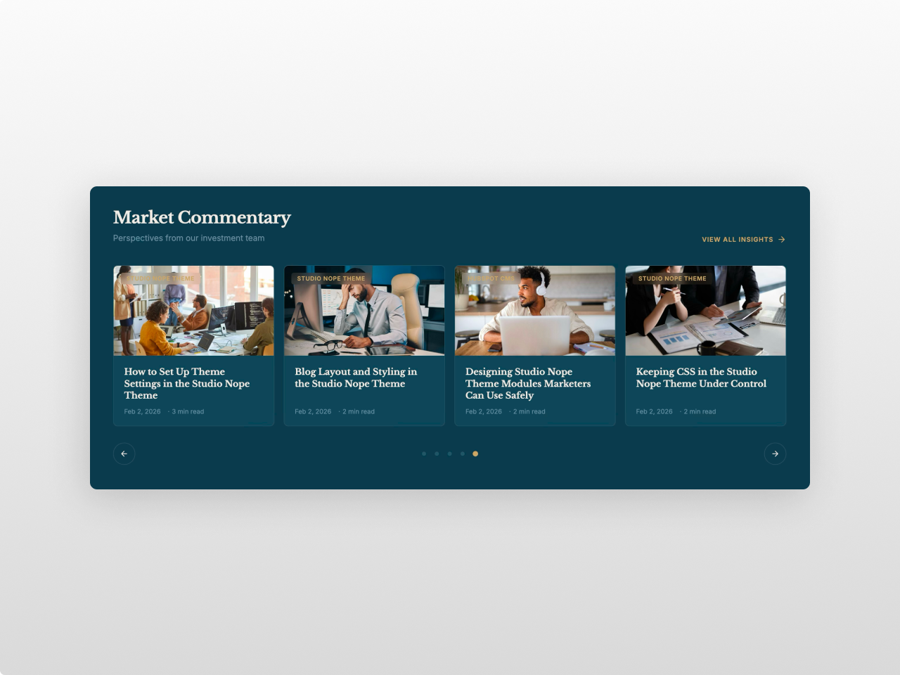
Dynamic Blog Filtering
Select any HubSpot blog, set post count (2 to 20), filter by tag, and exclude the current post on blog templates. Toggle featured images, excerpts, author photos, dates, tags, and reading time independently. Five image aspect ratios and four date formats.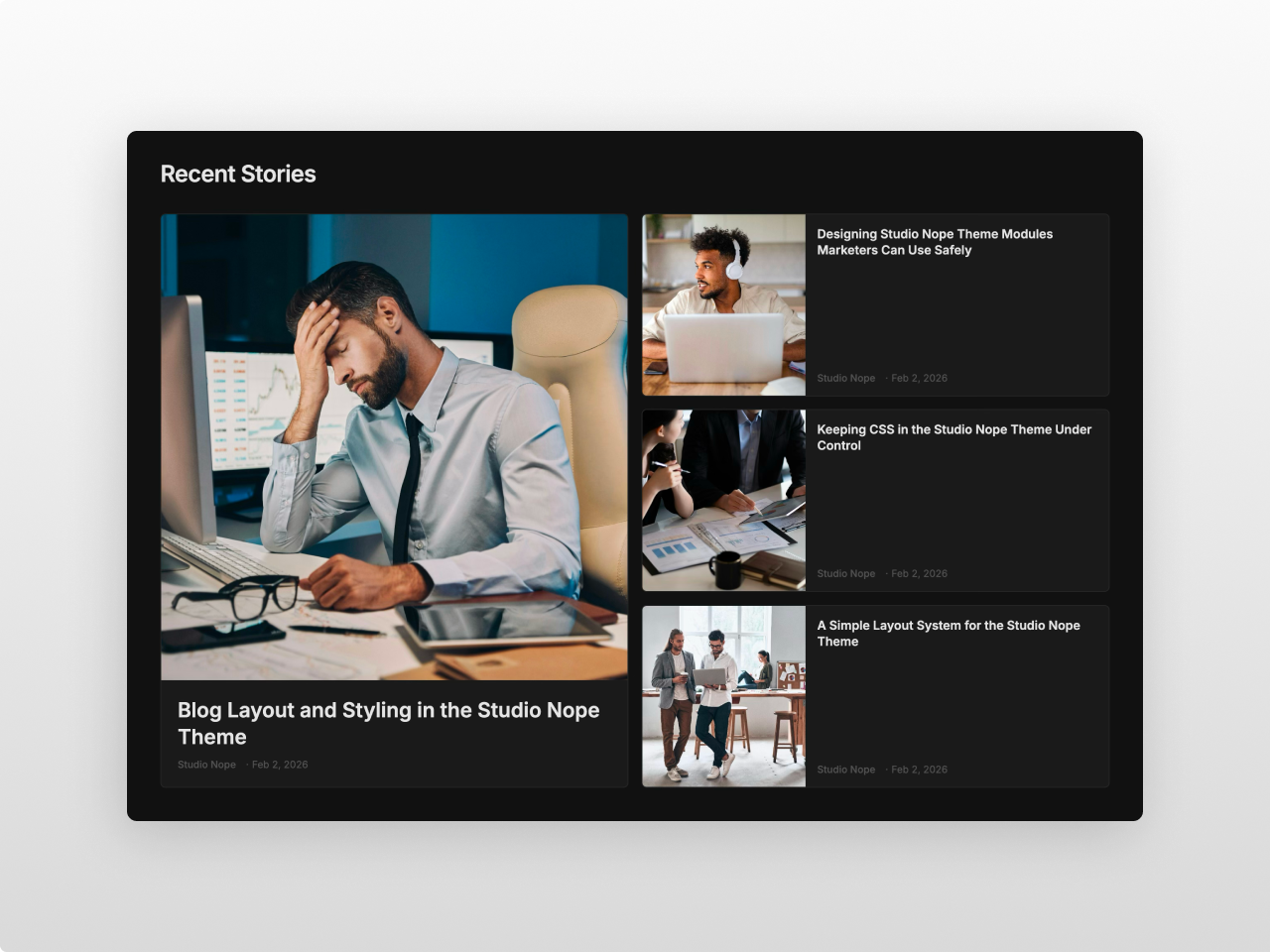
Complete Style Control
50+ fields covering colors, typography, card design, navigation, and spacing, all from the Style tab. Two Google Font pickers with theme inheritance. Full-width section backgrounds with centered content containers. Card shadows, hover effects, and border radius. No code required.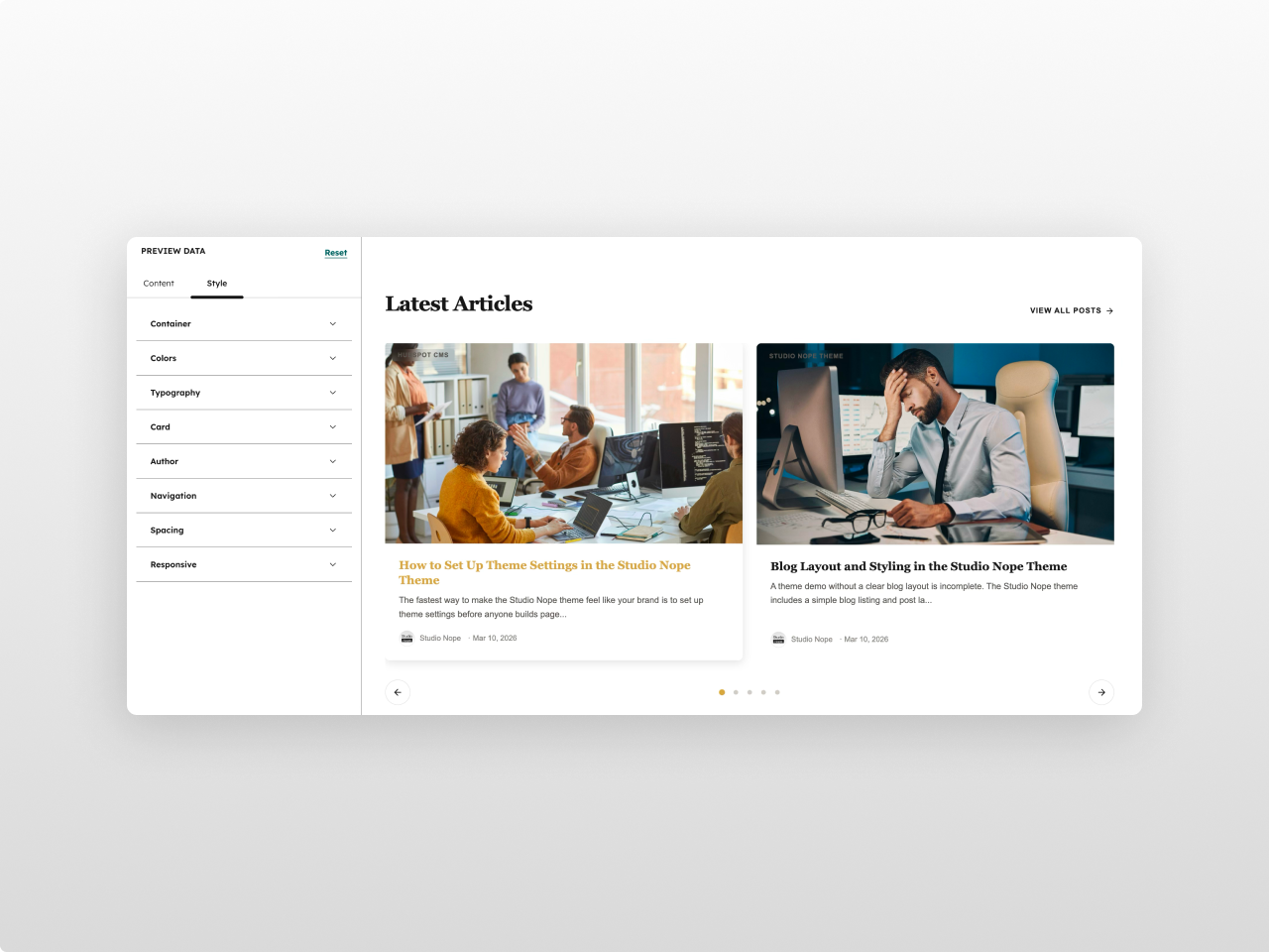
About Module
Total installs Fewer than 10 Created - Mar 20, 2026
Version 1 - Mar 20, 2026
Categories Tags
Requirements
HubSpot Subscription Works with all HubSpot plans

Contact Studio Nope
Legal Stuff
Please refer to the developer's Privacy Policy and Terms for more information.
Support
Studio Nope
- Romania
Visit website
Studio Nope designs and builds fast, clean HubSpot CMS websites and custom themes for teams that care about performance, editing experience, and reliable tracking.
Unlimited email support
Studio Nope typically responds in
- Monday
9:00 AM - 5:00 PM (EET) - Tuesday
9:00 AM - 5:00 PM (EET) - Wednesday
9:00 AM - 5:00 PM (EET) - Thursday
9:00 AM - 5:00 PM (EET) - Friday
9:00 AM - 5:00 PM (EET)
Studio Nope - Blog Carousel Customer Reviews
- Jul 21, 2026
Great blog module!
All of Studio Nopes' modules are clean and well organized. This links perfectly to capture blog posts, has lots of interface options, and is easy to use and change.
Super easy
Clean look
None.
Quigley, M.
Version 1