1/3 - Dark mode
Overview
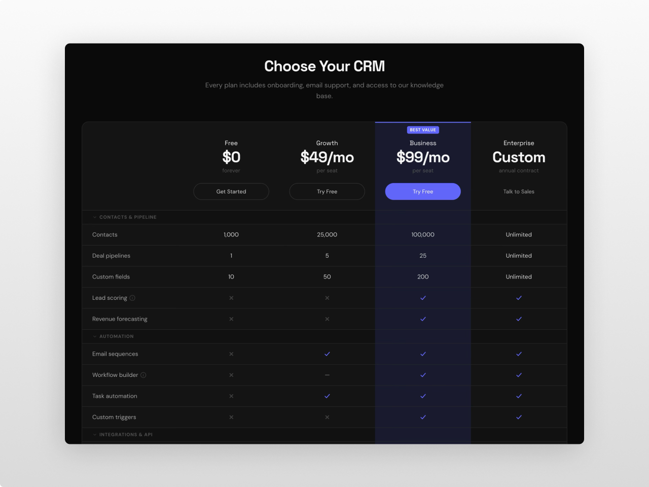
A premium product and feature comparison module built for SaaS, agencies, and service businesses. Comparison Matrix Pro displays plans, products, or services side by side in a structured grid with categorized feature rows, check/cross/partial icons, text values, tooltips, and fully customizable headers — all in one module with zero hardcoded values.
Every pixel is controlled from the Style tab: section background, container width, table background, borders, shadows, header colors, featured column highlight, badge positioning, category row styling, feature row striping, button styles (primary, secondary, ghost), toggle switch, tooltip design, and responsive breakpoints. 80+ style fields across 13 groups.
What you can build:
- SaaS plan comparison tables with monthly/annual billing toggle
- Product feature matrices with categorized rows and tooltips
- Service tier comparisons with highlighted "recommended" columns
- Dark mode comparison tables with custom color schemes
- Minimal two-column product comparisons
- Wide 5-column hosting or enterprise plan grids
- Compact comparison sections with collapsible categories
Content features: Up to 6 products, each with name, icon (SVG), dual pricing (for billing toggle), price note, CTA button (label + URL + style), and optional featured/badge toggle with custom badge text. Up to 10 feature categories, each collapsible with up to 30 features per category. Features support five value types per product: check, cross, partial, text, or empty. Optional tooltip per feature for additional context. Section heading with title, subtitle, configurable HTML tag (H1-H5), and alignment (center/left). The entire section heading can be toggled off for pages that don't need it.
Billing toggle: Animated switch between two pricing sets with customizable labels. Optional discount badge with configurable text. Smooth transition between price states. Toggle tabs with active/inactive styling and ARIA attributes.
Featured column: Any product can be marked as featured — the entire column (header, category rows, feature rows, CTA row) gets a distinct background highlight with optional top border accent. Featured badge with absolute positioning that sits in the header padding space without affecting content alignment.
Collapsible categories: Category rows act as accordion headers. Click to collapse or expand all feature rows within that category. Animated chevron indicator. Optional smooth max-height + opacity animation (controlled by settings toggle). Categories can be set to start collapsed.
Scroll reveal animation: IntersectionObserver-based entrance animations. Heading, toggle, and matrix fade up on scroll with staggered timing. Individual rows animate in sequence. Respects `prefers-reduced-motion`. Controlled by settings toggle.
Layout: CSS Grid based (not `<table>`) for full responsive control. Configurable column count (2-6). Split header/body architecture — header stays fixed while body scrolls horizontally on mobile. Sticky header option uses CSS `position: sticky` with automatic ancestor overflow fix via JavaScript.
Font control: Separate Primary font (title, product names, prices) and Secondary font (feature names, values, buttons, labels, tooltips, badges, categories). Full Google Fonts picker with auto-loading. "Inherit Fonts from Page" checkbox to use page/theme fonts instead.
Settings (8 toggles): Layout (compact/comfortable), sticky header, sticky first column, striped rows, show CTA row, hover highlight, animate collapse, scroll animation.
Style tab (80+ fields): Fonts (primary, secondary, inherit toggle) / Section (background, padding) / Container (max width) / Heading (title and subtitle colors, sizes, weights, margin) / Table (background, border color/width/radius, shadow, cell padding, stripe color, hover color) / Product Header (name and price colors/sizes/weights, note color/size) / Featured Column (background, header background, border color/width) / Badges (background, text color, font size, border radius) / Category Headers (background, text color, font size, font weight) / Feature Rows (name and value colors/sizes, check/cross/partial colors, icon size, tooltip background and text colors) / Buttons (primary, secondary, ghost — each with background, text, hover, border controls, font size, weight, padding, border radius, full-width toggle) / Toggle (background, text, active background/text, slider color, discount badge colors, border radius) / Responsive (font scaling at tablet and mobile breakpoints).
Accessibility: Semantic HTML heading tags (H1-H5), `aria-selected` on toggle tabs, `tabindex` and `aria-label` on tooltip triggers, keyboard-accessible collapsible categories, `prefers-reduced-motion` support.
Multiple instances on the same page are fully isolated via `{{ name }}` scoping — each instance has its own fonts, colors, animations, and settings with zero conflicts.
Works on any HubSpot template, no theme required. Pure vanilla JavaScript — no jQuery, no external dependencies.
Features
Side-by-Side Product Comparison Grid
Display 2 to 6 products in a CSS Grid layout with categorized feature rows, check/cross/partial icons, text values, and tooltips. Collapsible categories with smooth animation. Split header/body architecture for horizontal scroll on mobile while headers stay visible.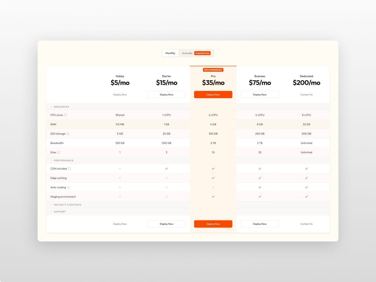
Billing Toggle & Featured Column
Animated billing period toggle with discount badge switches between two price sets per product. Mark any column as featured — the highlight extends through every row (header, categories, features, CTA) with distinct background and optional top border accent.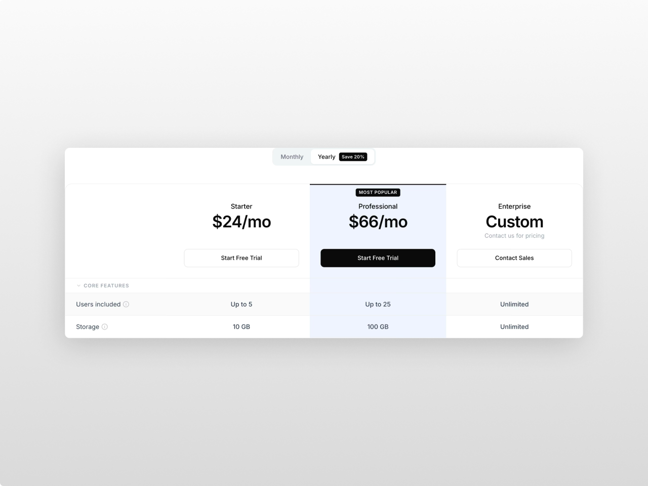
80+ Style Controls, Dual Font Pickers
Every visual element is configurable from the Style tab across 13 groups. Separate Primary and Secondary Google Fonts pickers with auto-loading, or inherit from the page/theme with one checkbox. Monochrome defaults that work out of the box.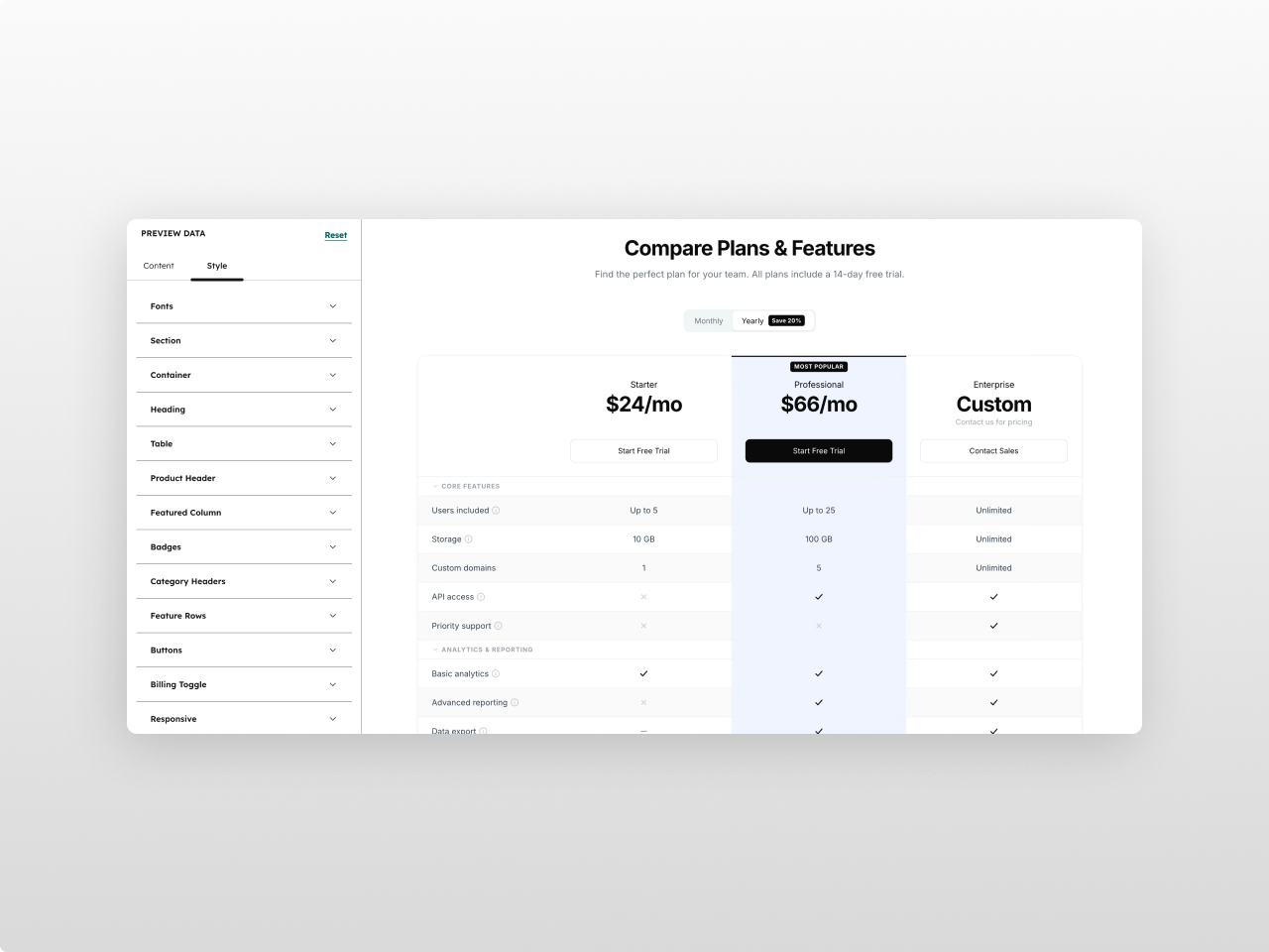
About Module
Total installs Fewer than 10 Created - Mar 9, 2026
Version 1 - Mar 9, 2026
Categories Tags
Requirements
HubSpot Subscription Works with all HubSpot plans
Contact Studio Nope
Legal Stuff
Please refer to the developer's Privacy Policy and Terms for more information.
Support
Studio Nope
- Romania
Visit website
Studio Nope designs and builds fast, clean HubSpot CMS websites and custom themes for teams that care about performance, editing experience, and reliable tracking.
Unlimited email support
Studio Nope typically responds in
- Monday
9:00 AM - 5:00 PM (EET) - Tuesday
9:00 AM - 5:00 PM (EET) - Wednesday
9:00 AM - 5:00 PM (EET) - Thursday
9:00 AM - 5:00 PM (EET) - Friday
9:00 AM - 5:00 PM (EET)