1/3 - One column
Overview
The most comprehensive FAQ module on the HubSpot marketplace. Three layout modes (split, full-width, multi-column grid), smart stacked/card item rendering, full rich text answer styling, subtitle, CTA link, and full font control via HubSpot's font picker.
Every element is customizable from the Style tab: container width, 12 color pickers (section bg, heading, eyebrow, subtitle, question, answer, icon, active states, item bg, item border, item hover bg, shadow color, CTA color), two font pickers (heading + body with theme inheritance), typography sizing for every text element, item card styling (padding, border radius, border width, box shadow), spacing, and responsive breakpoints. 45+ style fields in total.
What you can build:
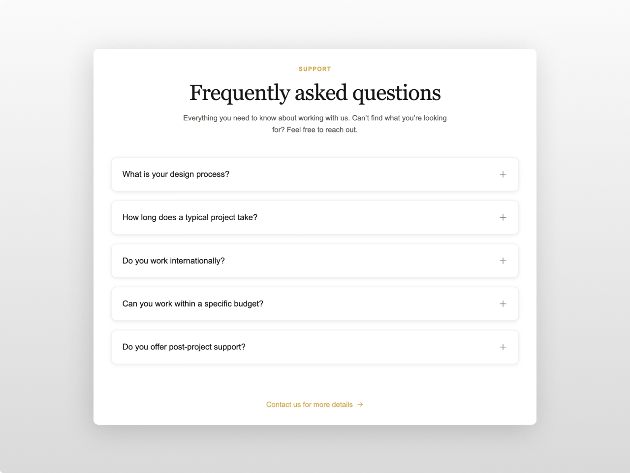
Classic centered FAQ sections with expandable answers
Split-layout FAQ with sticky heading alongside the accordion
Multi-column FAQ grids (2 or 3 columns) with card-style items
Stacked accordion in one unified box (gap 0) or individual cards (gap > 0)
Knowledge base style Q&A with rich text answers (headings, lists, blockquotes, tables, code, images)
Support page FAQ sections with shadows, hover effects, and CTA link
Content features: Section heading with eyebrow, subtitle, and configurable heading tag (H2/H3/H4). Up to 30 FAQ items with question text and rich text answers (supports headings, bold, italic, links, ordered/unordered lists, blockquotes, code blocks, tables, images, horizontal rules). Open first item toggle. Allow multiple items open simultaneously. Optional CTA link with arrow icon below the FAQ items.
Layout options: Split (heading left, accordion right with sticky header), Full (centered, max-width constrained), or Grid (1/2/3 column layout for card-style FAQs). Header alignment (center/left) for Full and Grid. All layouts are fully responsive and collapse to single column on mobile.
Style tab: Container (max width, horizontal padding), colors (section background, heading, eyebrow, subtitle, CTA link, question, answer, icon, active question, active icon, item background, item border, item hover background, shadow color), typography (heading font picker, body font picker — both inheriting from HubSpot theme, heading/subtitle/eyebrow/question/answer font sizes, answer line height), item card (vertical/horizontal padding, gap, border radius, border width, box shadow, icon size, answer max width), spacing (padding top/bottom), responsive (tablet/mobile breakpoints). Smart rendering: gap 0 merges items into one unified box with shared border/radius/shadow; gap > 0 renders each item as an individual card. Accent colors inherit from HubSpot theme settings.
Works on any HubSpot template, no theme required.
Features
Three Layout Modes
Split layout with sticky heading on the left. Full-width centered accordion. Multi-column grid (1, 2, or 3 columns) for card-style FAQ layouts. Header alignment control (center/left). All fully responsive — grid collapses to single column on tablet and mobile.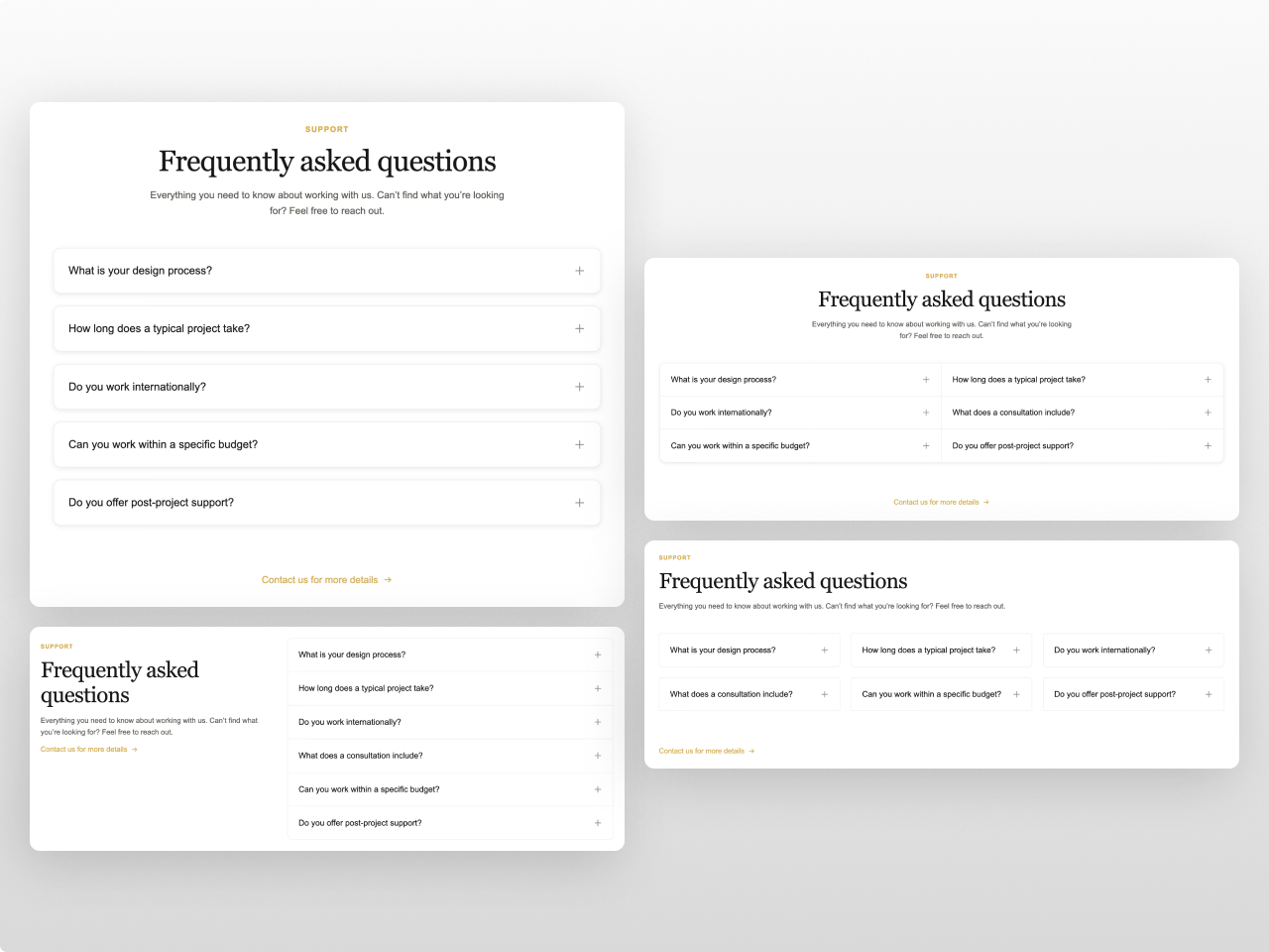
Smart Stacked & Card Rendering
Set gap to 0 and items merge into one unified box with shared border, radius, shadow, and divider lines between items. Set gap > 0 and each item becomes its own card with individual border, radius, and shadow. Hover background for interactive feedback. Allow-multiple-open option.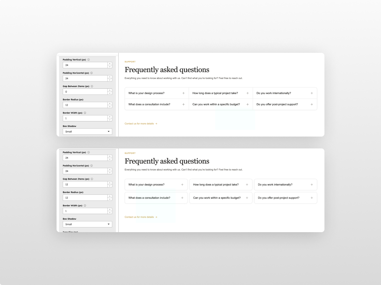
Full Rich Text Answers
Answers support headings, bold, italic, links, ordered/unordered lists, blockquotes with accent border, inline code, code blocks, tables, images, and horizontal rules — all styled from the module settings using your chosen fonts and colors.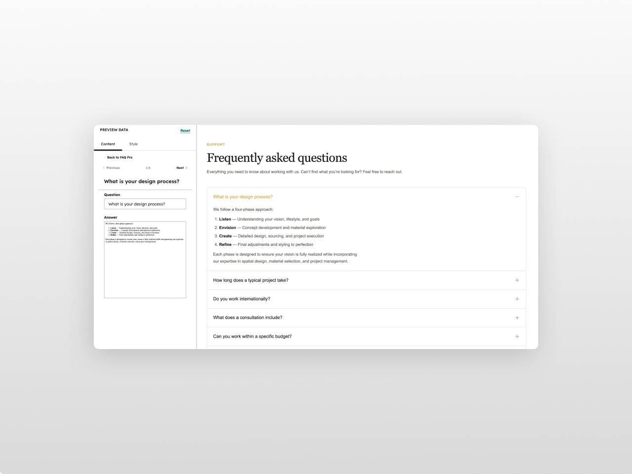
Custom Fonts & CTA
Two font pickers (heading + body) with full HubSpot font library access and theme inheritance. Subtitle text below heading. Optional CTA link with animated arrow icon. Configurable font sizes for every text element.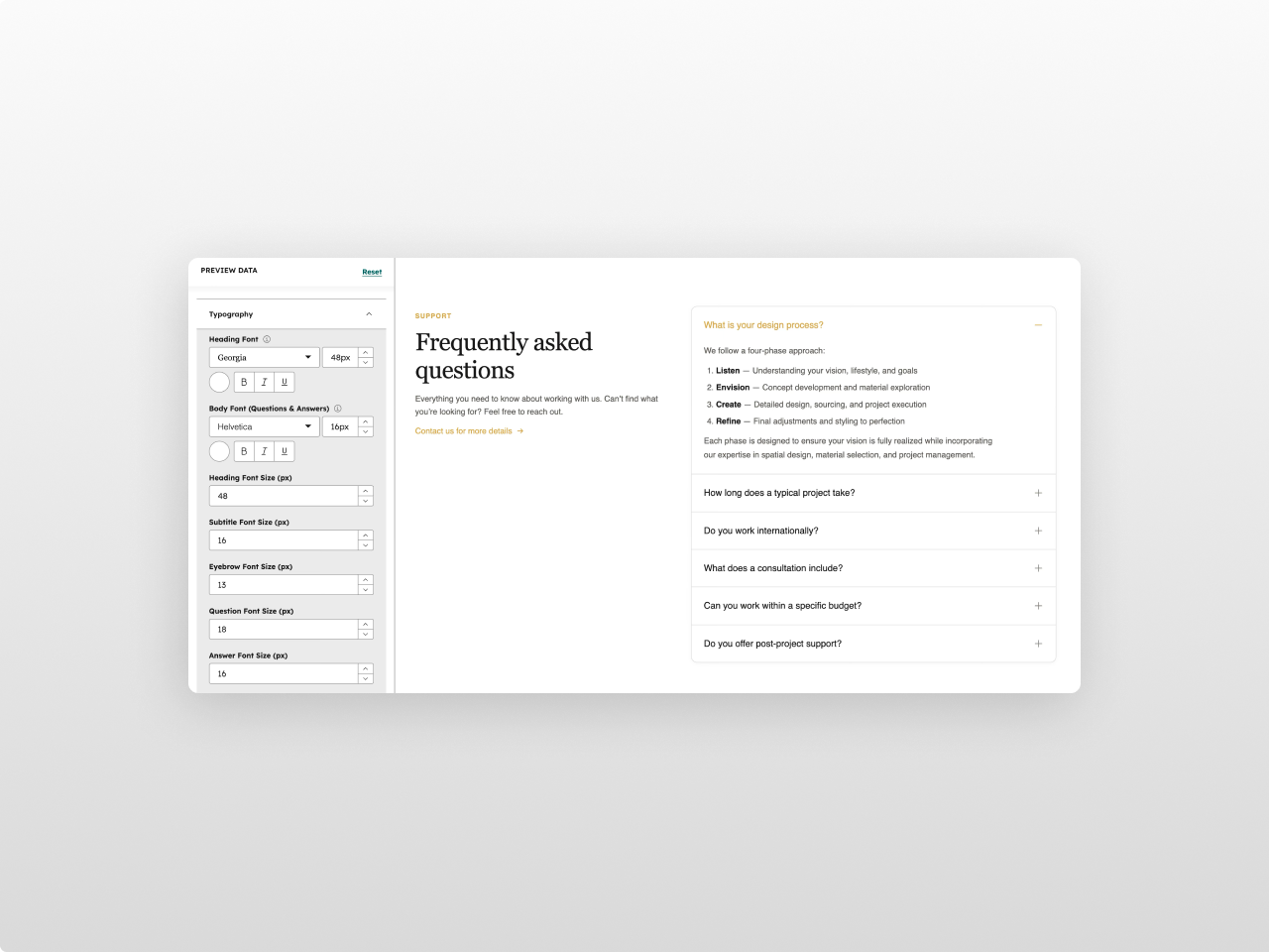
45+ Style Controls
12 color pickers (all with opacity), font pickers, typography sizing, item card styling (padding, radius, border, shadow), configurable icon, answer max width, and responsive breakpoints. Accent colors inherit automatically from your HubSpot theme.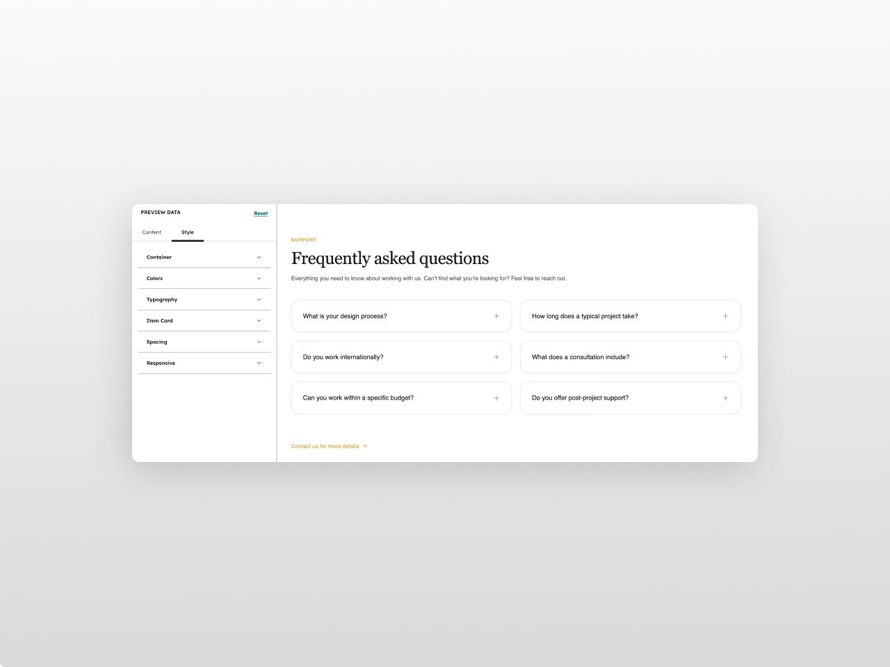
About Module
Total installs Fewer than 10 Created - Feb 23, 2026
Version 2 - Apr 10, 2026
Categories Tags
Requirements
HubSpot Subscription Works with all HubSpot plans
Contact Studio Nope
Legal Stuff
Please refer to the developer's Privacy Policy and Terms for more information.
Support
Studio Nope
- Romania
Visit website
Studio Nope designs and builds fast, clean HubSpot CMS websites and custom themes for teams that care about performance, editing experience, and reliable tracking.
Unlimited email support
Studio Nope typically responds in
- Monday
9:00 AM - 5:00 PM (EET) - Tuesday
9:00 AM - 5:00 PM (EET) - Wednesday
9:00 AM - 5:00 PM (EET) - Thursday
9:00 AM - 5:00 PM (EET) - Friday
9:00 AM - 5:00 PM (EET)