1/3 - Bento grid - 3 columns
Overview
A premium image gallery module built for portfolios, case studies, and visual storytelling. Image Gallery Pro gives you three layout modes (Bento Grid, Equal Grid, and Masonry) with built-in lightbox, video support, and hover effects — all managed from a single, intuitive editor.
Every element is fully customizable from the Style tab: container width, grid gap, border radius, row heights, background colors, placeholder colors, hover zoom scale and speed, caption typography and gradient overlays, and a complete lightbox with configurable backdrop, button, and text colors. 33 style fields in total.
What you can build:
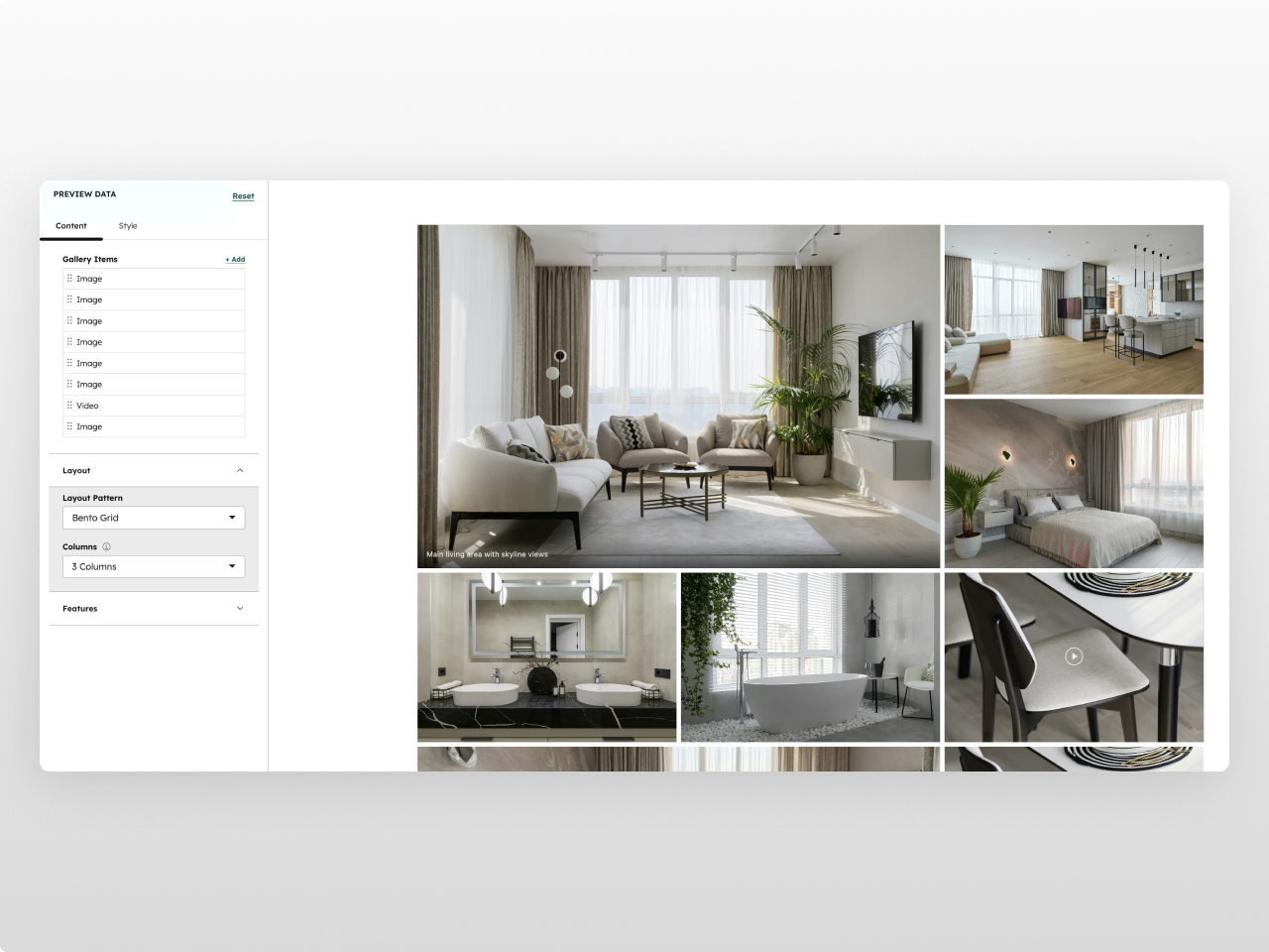
Bento-style editorial galleries with varied image sizes
Clean equal grids with landscape, portrait, square, or original aspect ratios
Masonry layouts with automatic dense packing
Mixed media galleries combining images and inline video
Full-screen lightbox experiences with keyboard and touch navigation
Content features: Up to 30 gallery items, each configurable as an image or video. Video items support MP4 files with custom poster thumbnails and auto-play on hover. Every item gets an optional caption with hover reveal animation. Three layout patterns with 2, 3, or 4 column configurations. Aspect ratio control for equal grid mode (landscape 3:2, portrait 2:3, square 1:1, or original).
Lightbox: Click-to-open full-screen viewer with previous/next navigation, keyboard shortcuts (arrow keys, escape), touch swipe on mobile, image counter, and caption display. Videos play inline with native controls.
Settings: Enable or disable lightbox, hover zoom, and caption overlays independently. Custom responsive breakpoints for tablet, mobile, and small screens. Configurable container max width and horizontal padding.
Style tab (33 fields): Container (max width, horizontal padding) / Grid (gap, border radius, min/max row height) / Colors (section background with opacity, loading placeholder) / Hover effects (zoom scale, transition speed) / Captions (text color, font size, gradient background, padding) / Lightbox (backdrop color, button color, button hover color, caption color, counter color — all with opacity control) / Spacing (top and bottom padding) / Responsive (tablet, mobile, and small screen breakpoints).
Works on any HubSpot template, no theme required. Inherits your brand colors automatically.
Features
Bento, Grid & Masonry Layouts
Three layout modes to match any design style. Bento creates dynamic, editorial-feel galleries with varied image sizes. Equal Grid gives you clean rows with consistent aspect ratios. Masonry fills space efficiently with dense auto-packing.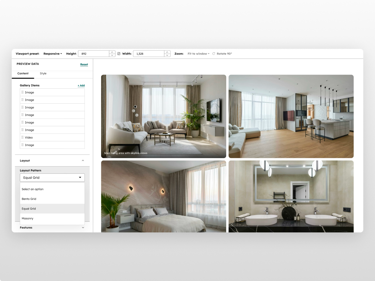
Built-in Lightbox with Video Support
Full-screen lightbox with smooth open/close animations, previous/next navigation, keyboard shortcuts, and touch swipe on mobile. Mix images and MP4 videos in the same gallery — videos auto-play on hover in the grid and play with native controls in the lightbox.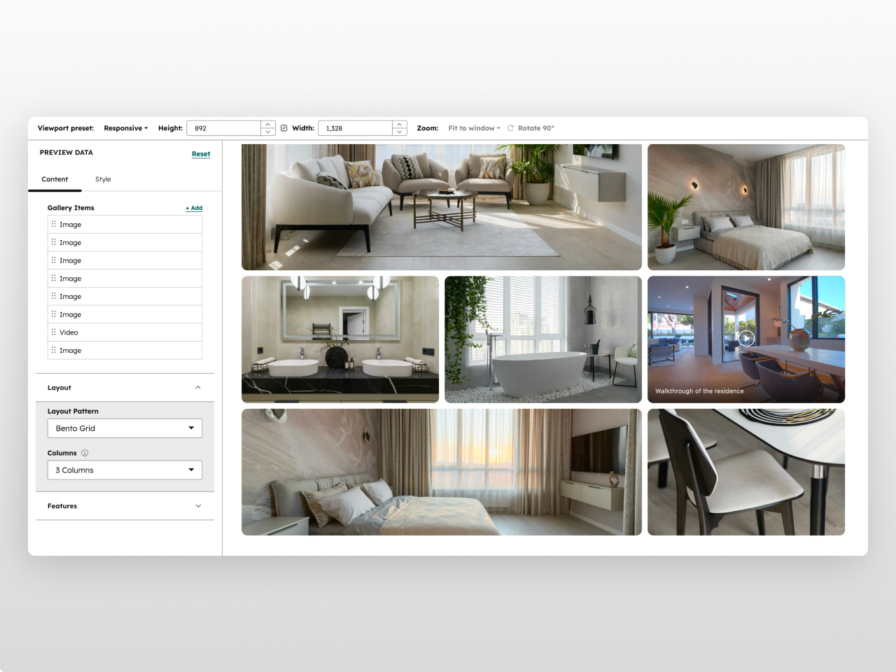
33 Style Controls, Zero Code
Every visual element has its own style section: grid gap, border radius, row heights, hover zoom scale and speed, caption colors and gradients, lightbox backdrop and button styling — all with full opacity control. Custom responsive breakpoints let you control exactly when columns collapse.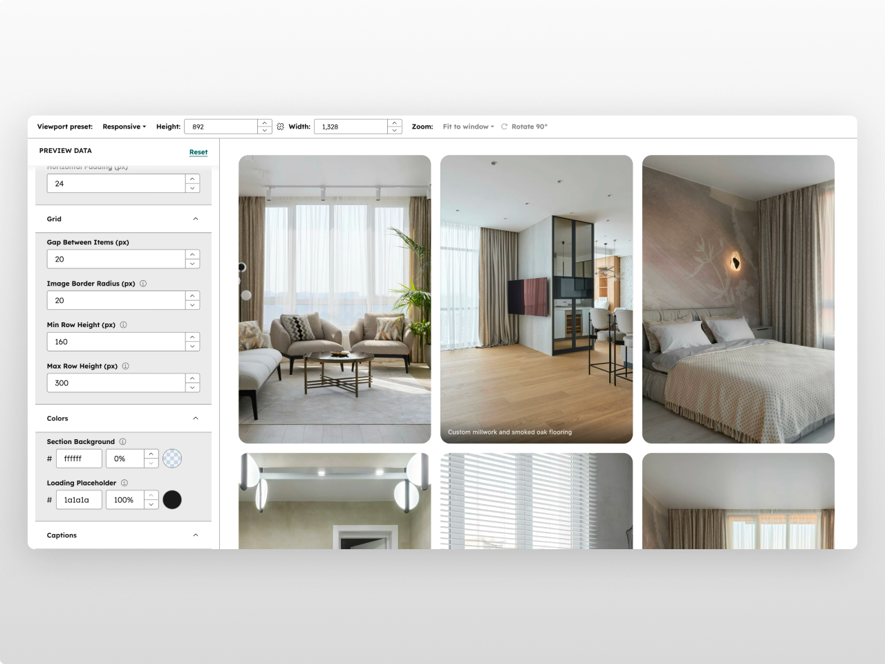
About Module
Total installs Fewer than 10 Created - Feb 23, 2026
Version 1 - Feb 23, 2026
Categories Tags
Requirements
HubSpot Subscription Works with all HubSpot plans
Contact Studio Nope
Legal Stuff
Please refer to the developer's Privacy Policy and Terms for more information.
Support
Studio Nope
- Romania
Visit website
Studio Nope designs and builds fast, clean HubSpot CMS websites and custom themes for teams that care about performance, editing experience, and reliable tracking.
Unlimited email support
Studio Nope typically responds in
- Monday
9:00 AM - 5:00 PM (EET) - Tuesday
9:00 AM - 5:00 PM (EET) - Wednesday
9:00 AM - 5:00 PM (EET) - Thursday
9:00 AM - 5:00 PM (EET) - Friday
9:00 AM - 5:00 PM (EET)