1/3 - Horizontal list cards on light gray
Overview
A premium integration directory module that displays your app ecosystem in a searchable, filterable grid. Integration Showcase Pro gives you three layout modes, category tabs, live search, detail modals with rich text content, and complete style control from the module editor.
Add integrations via the repeater field with a logo, name, category, short description, rich text detail content for the modal, link, optional badge, and a featured toggle to pin entries to the top. Choose grid, list, or compact layout. Enable search and category filter tabs so visitors can browse your ecosystem instantly. Configure how cards behave on click: open a detail modal, navigate to a link, or no action.
Every element is fully customizable from the Style tab. 87 style fields control card backgrounds, borders, shadows, hover effects, logo sizing and borders, arrow button size and shape, badge appearance, toolbar styling, modal design including button colors, padding, radius, and shadow, typography with two Google Font pickers, Load More button styling, spacing, and responsive breakpoints. Section backgrounds span full width with centered content containers. Nothing is hardcoded.
What you can build:
Monochrome integration directories with collapsed-border table grids, zero gap, square corners, and Geist font
SaaS app directories with rounded shadow cards, blue filter pills, and "Learn more" text links
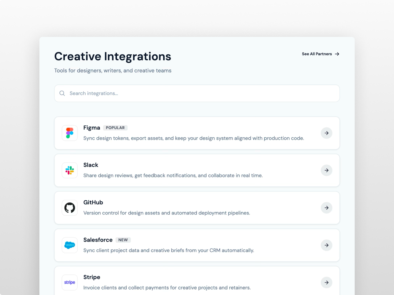
Creative tool showcases in horizontal list layout with large logos, search bar, and arrow buttons
Developer platform pages on dark backgrounds with wide 2-column cards, purple accents, and square arrow buttons
Enterprise partner grids in compact layout with small logos, gold filter tabs on dark navy, and subtle card backgrounds
Content features include a repeater supporting up to 200 integration entries. Each entry has a logo image with auto-generated initial placeholder when no image is provided, name, category for filtering, short card description, rich text detail description for the modal with headings and lists, external link, optional badge label (Popular, New, Premium, or custom text), and a featured toggle that pins entries first. Categories are managed as a separate repeater with labels and slugs so you control filter tab order and naming independently.
Grid layout displays cards in 2, 3, or 4 columns with center or left alignment. List layout renders horizontal cards with logo on the left and content flowing right in a single column.
Compact layout shows logo and name only in a tight multi-column grid with no descriptions. All three layouts wrap responsively on tablet and mobile with configurable breakpoints.
Cards support three click behaviors: open a detail modal, navigate directly to the integration link, or no action. Two card action styles are available: a text link with sliding arrow, or a round or square arrow button with configurable size, shape, and alignment. The detail modal displays the integration logo at a configurable size, name with badge, full rich text content with styled headings and lists, and a button linking to the integration. The modal includes backdrop overlay, scale-in animation, body scroll lock, Escape key to close, backdrop click to close, and keyboard focus management.
Search filters by name, description, and category with debounced input. Category tabs managed via a separate repeater filter the grid instantly. Both work together and toggle independently. An optional count display shows how many integrations are currently visible. Load More pagination with configurable initial count, button radius, padding, and font size.
The Style tab organizes 87 fields into clear groups. Colors covers 35 fields for section background, card styling with separate background, border, and hover colors, all text elements, search input appearance, filter pill states, badges, count display, modal background, overlay, title, text, border, content headings, content lists, modal button with background, text, and hover colors, CTA link colors, and Load More button. Typography includes two Google Font pickers with theme inheritance plus 12 individual size controls. Card styling covers border radius, padding, gap, shadow with four levels, hover shadow, logo size, logo radius, logo border color, arrow button size, card content gap, and Load More button radius, padding, and font size. Toolbar covers search and filter pill dimensions and gaps. Badge covers radius and padding. Modal covers radius, padding, width, shadow, logo size, and button font size, padding, radius, and shadow. Spacing and responsive breakpoints complete the system.
Zero external dependencies, vanilla JavaScript only. All CSS scoped per instance for multiple modules on the same page. Semantic HTML, ARIA attributes on interactive elements, keyboard navigation for cards and modal, focus trap when modal is open. Filter tabs wrap responsively. Works on any HubSpot template with no theme required.
Features
Three Layouts with Detail Modals
Grid, list, and compact layouts with 2 to 4 columns. Cards open rich text modals with logo, badge, and styled button. Two action styles: text link or arrow button with configurable shape and position.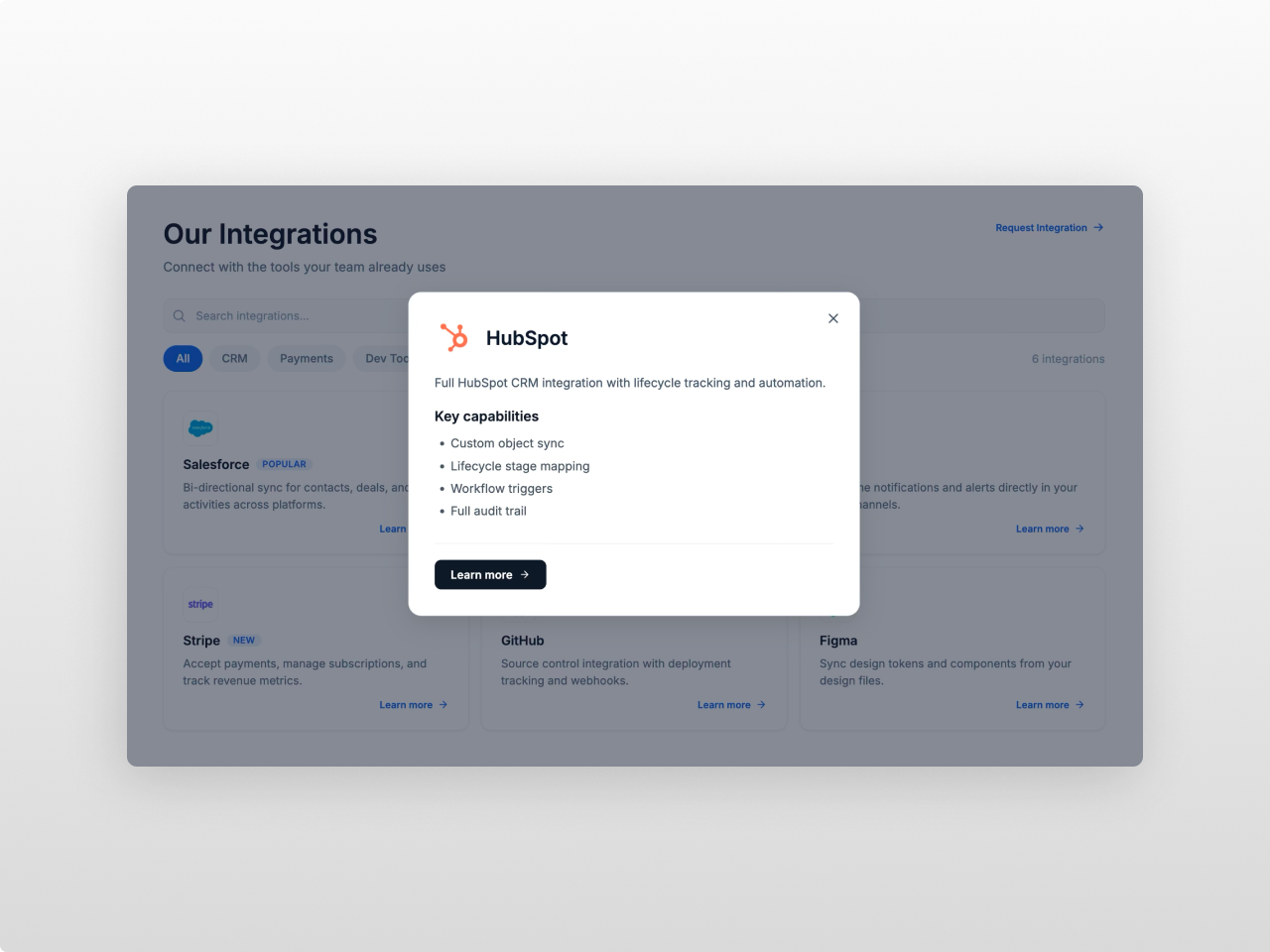
Search, Filters, and Featured Pins
Live search with debounce, category filter tabs from a separate repeater, featured toggle to pin entries first. Optional count display and Load More pagination with styled button.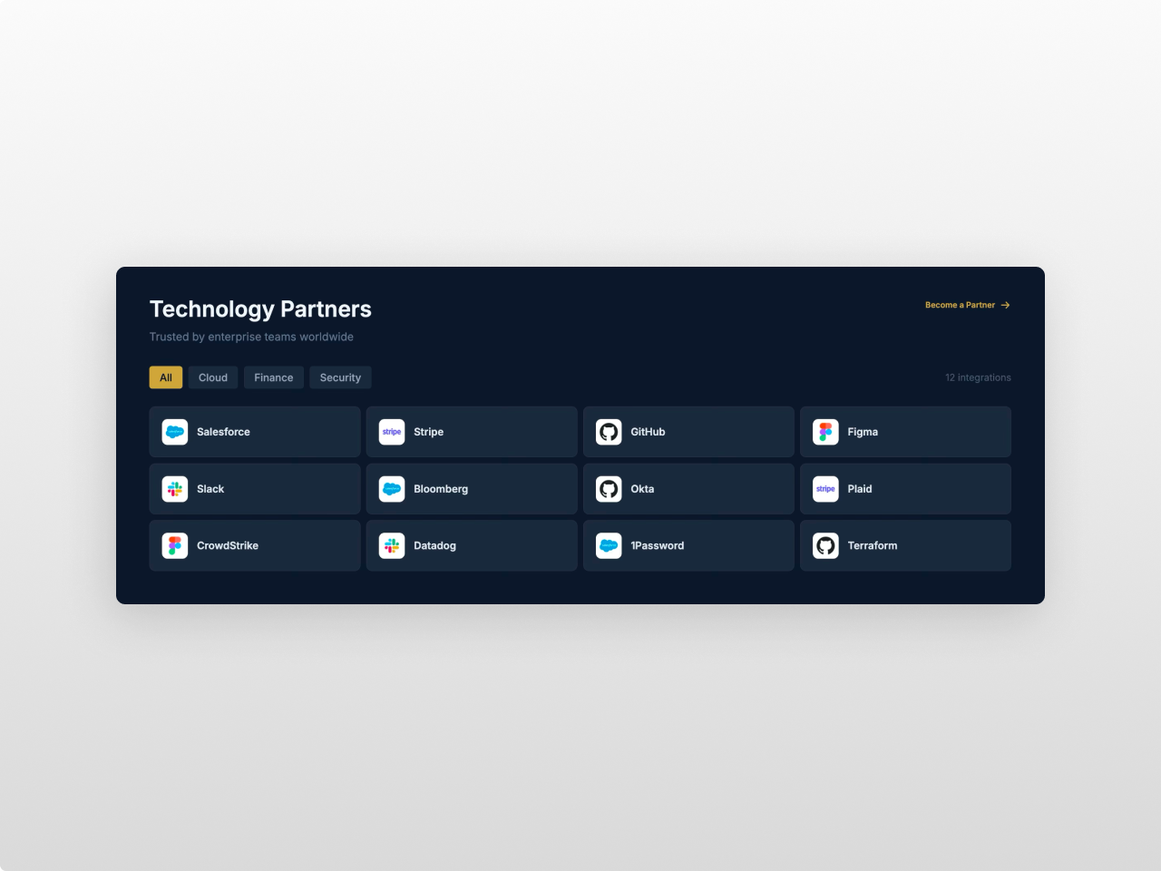
87 Style Fields, Nothing Hardcoded
35 colors, 2 font pickers, card and logo sizing, arrow button shape, toolbar and badge styling, modal button design, Load More styling, spacing, and responsive breakpoints. All from the Style tab.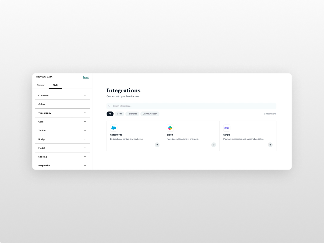
About Module
Total installs Fewer than 10 Created - Mar 20, 2026
Version 1 - Mar 20, 2026
Categories Tags
Requirements
HubSpot Subscription Works with all HubSpot plans
Contact Studio Nope
Legal Stuff
Please refer to the developer's Privacy Policy and Terms for more information.
Support
Studio Nope
- Romania
Visit website
Studio Nope designs and builds fast, clean HubSpot CMS websites and custom themes for teams that care about performance, editing experience, and reliable tracking.
Unlimited email support
Studio Nope typically responds in
- Monday
9:00 AM - 5:00 PM (EET) - Tuesday
9:00 AM - 5:00 PM (EET) - Wednesday
9:00 AM - 5:00 PM (EET) - Thursday
9:00 AM - 5:00 PM (EET) - Friday
9:00 AM - 5:00 PM (EET)