1/3 - Submenu with highlight column
Overview
A premium navigation module built for teams that want total design control without writing code. Mega Menu Pro gives you three menu types (simple links, dropdown lists, and rich multi-column mega menus) all managed from a single, intuitive editor.
Every element is fully customizable from the Style tab: navigation bar background (solid, gradient, image, transparent, or frosted glass), typography, spacing, borders, shadows, and border radius. Dropdown panels, menu items, mega menu columns, badges, CTA buttons, and the mobile panel each have their own dedicated style controls. 115+ style fields in total.
What you can build:
Clean minimal navbars with simple dropdowns
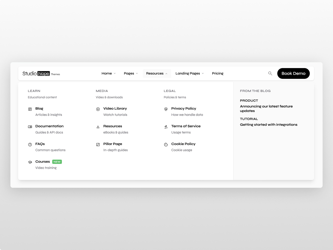
Rich mega menus with up to 5 columns, featured blog posts, promotional banners, and embedded HubSpot forms
Product carousels inside mega menu sidebars for e-commerce navigation
Transparent or frosted glass headers that shrink on scroll over hero images
Dark mode navigation with gradient or image backgrounds
Click-to-open menus for touch-heavy audiences
Fully branded CTAs with primary, secondary, and ghost button styles
Content features: Up to 10 top-level menu items, each configurable as a link, dropdown, or mega menu. Dropdown items support icons (FontAwesome 5 via HubSpot icon picker), images, descriptions, and badges (New, Beta, Coming Soon, or custom text). Mega menus support 2-5 columns with optional sidebar content: featured blog posts with images and tags, promotional banners with eyebrow/title/CTA, embedded HubSpot forms for lead capture, and a product carousel with auto-rotation and dot navigation. Add up to 3 CTA buttons with link, anchor scroll, or modal trigger actions. Built-in site search with live suggestions. Language switcher with three display modes (localized, native, hybrid) for multi-language sites.
Settings: Sticky or static positioning with configurable top spacing. Shrink-on-scroll reduces padding and logo size as users scroll. Transparent hero mode starts the nav clear and transitions to solid on scroll. Click-to-open mode for touch-friendly dropdown behavior. Five dropdown animation modes (morph, fade, slide, scale, or instant). Separate tablet and mobile breakpoints. Fully responsive with a dedicated mobile panel.
Style tab (115+ fields): Navigation bar (background type with 6 options including gradient and image, colors, blur, border, radius, shadow, padding, font size/weight, container width) / Menu links (colors, hover states, font, padding, radius, active indicator) / Dropdown panels (background with opacity for glass effects, border, shadow, padding, blur, gap) / Dropdown items (text, description, hover, icon color/size, image radius, padding) / Mega menu (column gap, title color/size/weight/transform) / Sidebar (background, tag colors, image radius) / Badges (colors, font size, radius, padding) / Buttons (primary/secondary/ghost each with background, text, hover, border controls, font, padding, radius) / Mobile panel (background, text, accent, divider, submenu bg, shadow, radius) / Global (accent colors, spacing unit, border radius base, shadow intensity, transition speed, letter spacing, blur strength, opacity values, font sizes).
Accessibility: Full keyboard navigation (Arrow keys, Tab, Escape), ARIA attributes (menubar, menu, aria-expanded, aria-haspopup, aria-hidden), screen reader compatible. Monochrome defaults out of the box — clean black, white, and gray that work with any brand.
Works on any HubSpot template, no theme required.
Features
Morphing Mega Menu Panels
Multi-column layouts (2-5 columns) with smooth morphing animations. Add featured blog posts, promo banners, embedded forms, product carousels, badges, and footer links — all from the visual editor.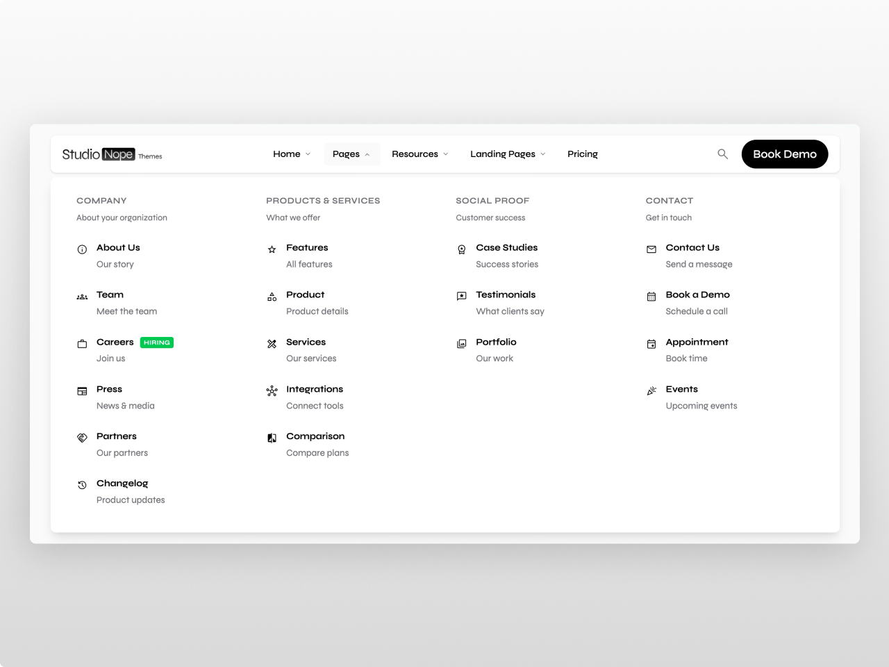
89 Style Controls, Zero Code
Every element has its own style section: backgrounds (solid, gradient, image, frosted glass), typography, spacing, borders, shadows, hover states, and border radius. Buttons get full primary/secondary/ghost customization. Brand colors inherit automatically from your HubSpot settings.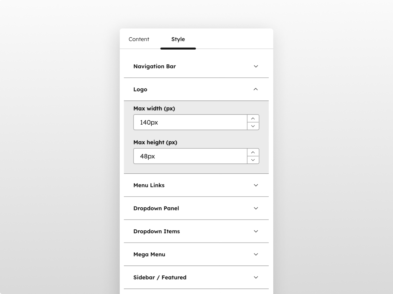
Fully Responsive with Custom Breakpoints
Dedicated mobile panel with its own style controls, configurable breakpoints, hamburger toggle animation, collapsible submenus, and mobile-optimized search. Sticky positioning with frosted glass blur keeps the navigation accessible on scroll.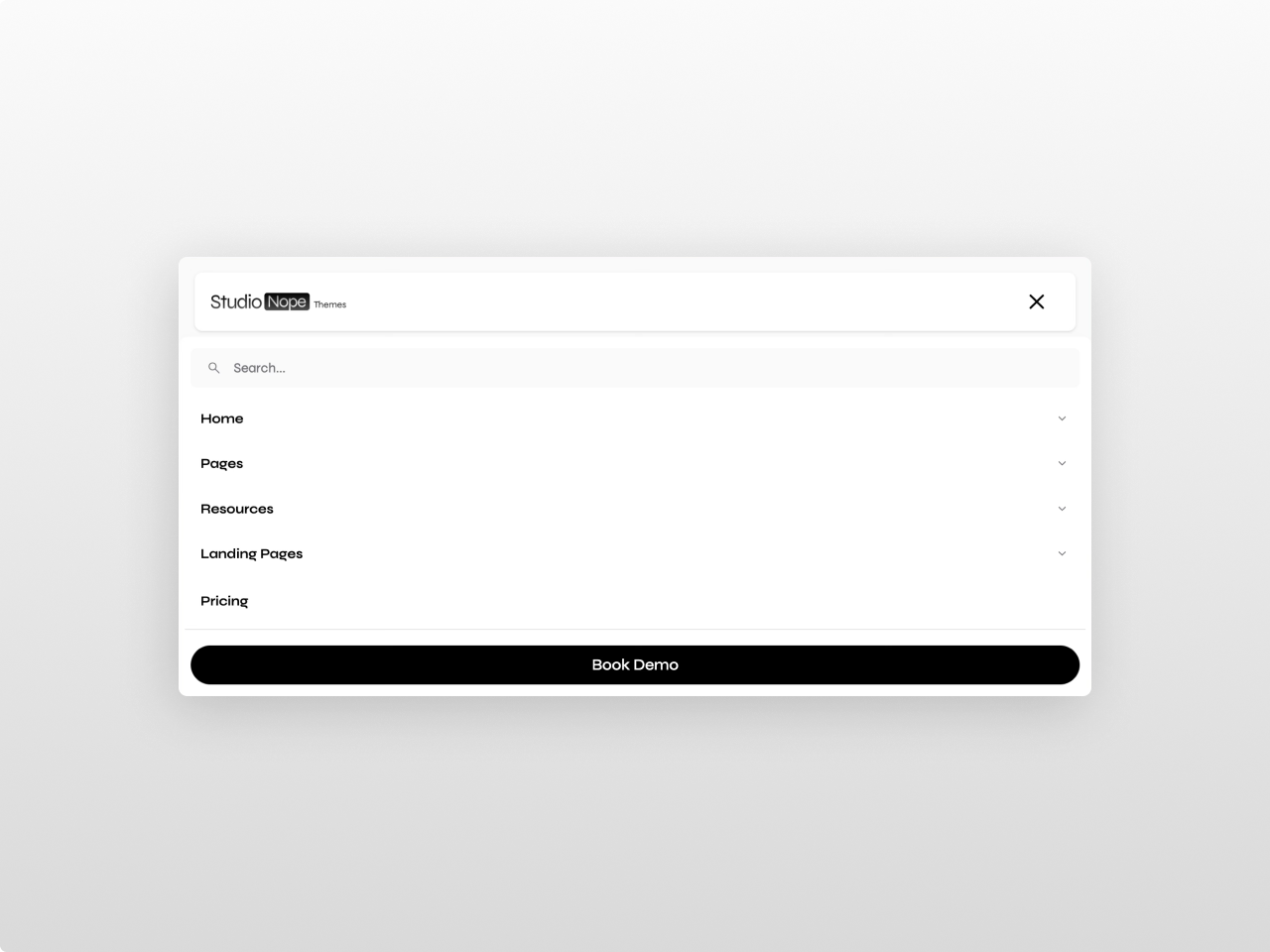
About Module
Total installs - 10+
Created - Feb 17, 2026
Version 3 - Apr 10, 2026
Categories Tags
Requirements
HubSpot Subscription
Contact Studio Nope
Legal Stuff
Please refer to the developer's Privacy Policy and Terms for more information.
Support
Studio Nope
- Romania
Visit website
Studio Nope designs and builds fast, clean HubSpot CMS websites and custom themes for teams that care about performance, editing experience, and reliable tracking.
Unlimited email support
Studio Nope typically responds in
- Monday
9:00 AM - 5:00 PM (EET) - Tuesday
9:00 AM - 5:00 PM (EET) - Wednesday
9:00 AM - 5:00 PM (EET) - Thursday
9:00 AM - 5:00 PM (EET) - Friday
9:00 AM - 5:00 PM (EET)