1/3 - Two columns with box shadow
Overview
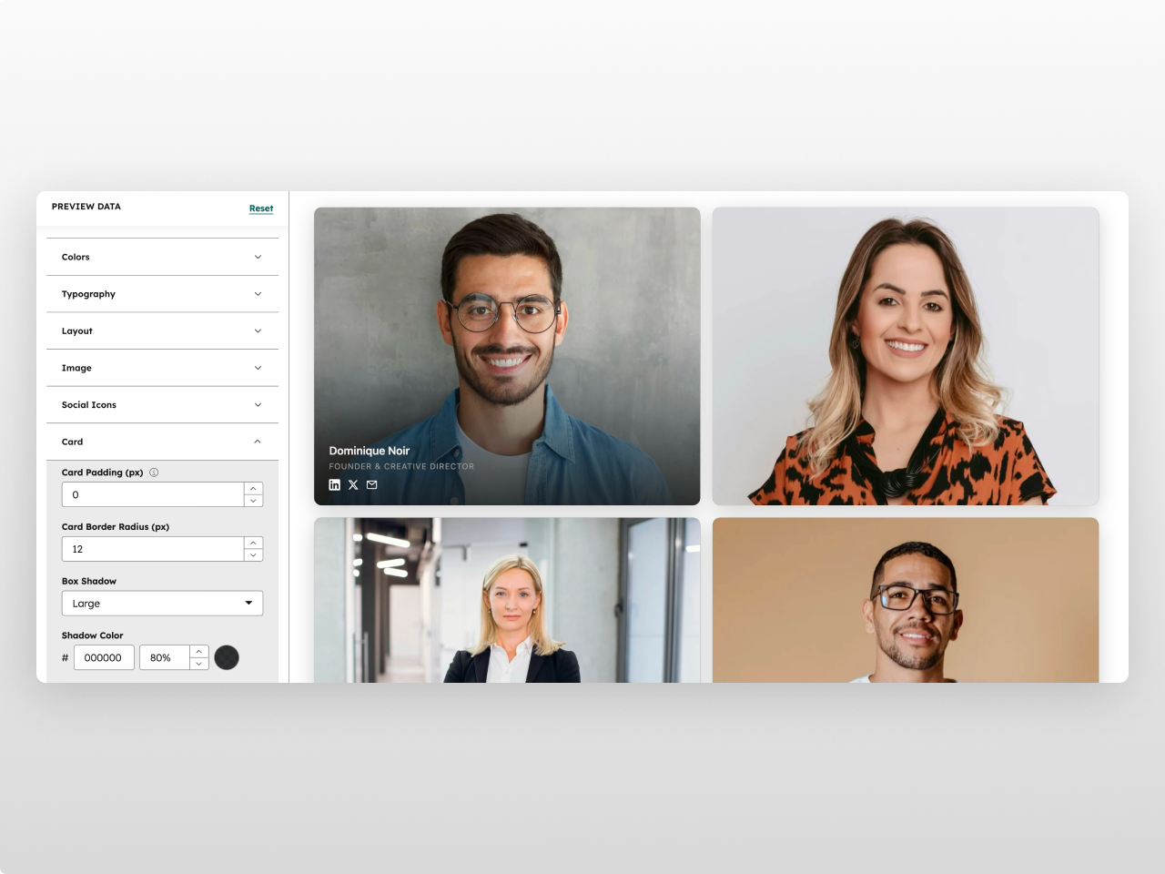
A professional team showcase module that displays member photos, names, roles, and social links in a responsive grid. Team Grid Pro supports hover effects, configurable aspect ratios, and social media icons that appear on hover or always visible.
Every element is customizable from the Style tab: container width, card styling (background, border, padding, border radius, box shadow), image aspect ratio, border radius, max height, text colors, social icon styling (size, color, hover color), hover zoom effect, spacing, and responsive breakpoints. 30+ style fields in total.
What you can build:
Corporate team pages with professional headshots
Agency about sections with creative portraits
Department team showcases with role descriptions
Leadership pages with social links
Freelancer profile grids
Content features: Up to 12 team members with photo, name, role, and optional social links (LinkedIn, Twitter/X, Email). Photos support alt text for accessibility.
Layout: 2, 3, or 4 column grid with configurable gap. Portrait or square aspect ratio for photos. Optional hover zoom on images. Social icons configurable to show on hover or always visible.
Style tab: Container (max width, horizontal padding), colors (background, name, role, card background, card border, social icon, social hover, shadow color), typography (name/role font sizes), layout (columns, gap), image (aspect ratio, border radius, max height, hover zoom), social (show on hover, icon size), card (padding, border radius, box shadow), spacing (padding top/bottom), responsive (tablet/mobile breakpoints). Social hover color inherits from HubSpot theme settings.
Features
Responsive Photo Grid
2, 3, or 4 column layout with configurable gap. Portrait or square aspect ratios with max height cap to keep cards proportional across all column counts. Hover zoom effect on images. Cards automatically stack on mobile with smooth transitions.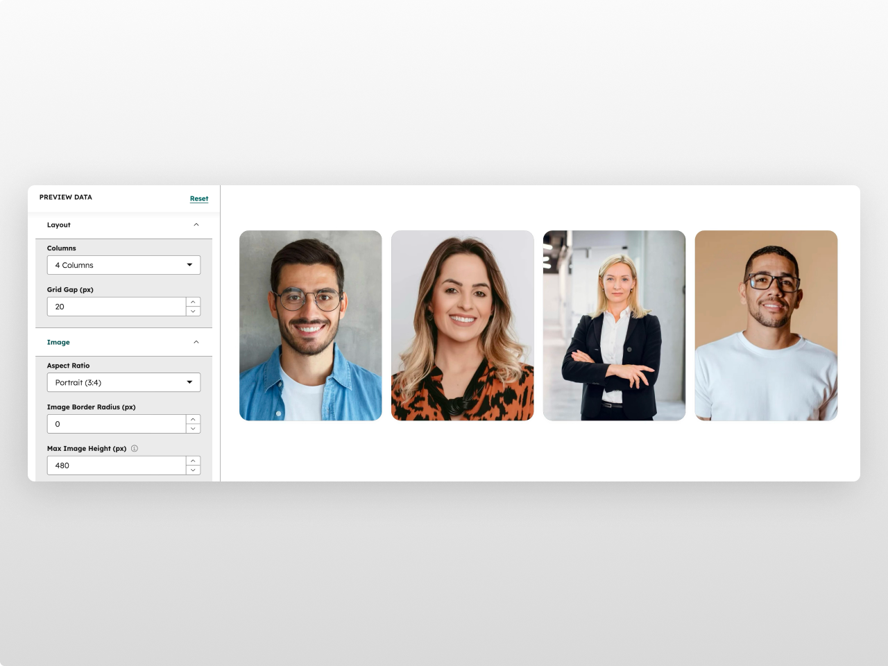
Social Media Integration
LinkedIn, Twitter/X, and Email icons per team member. Show always or reveal on hover. Configurable icon size, color, and hover color with smooth transitions.
30+ Style Controls
Full control over card styling (background, border, radius, padding, box shadow), image treatment (aspect ratio, border radius, max height, zoom), text colors, social icon appearance, and responsive breakpoints. Social accent color inherits from your HubSpot theme.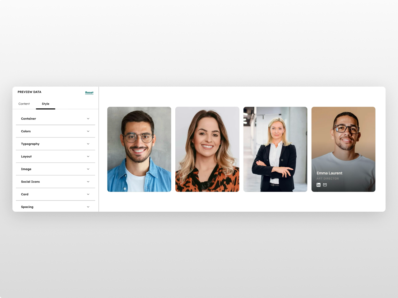
About Module
Total installs Fewer than 10 Created - Feb 23, 2026
Version 1 - Feb 23, 2026
Categories Tags
Requirements
HubSpot Subscription Works with all HubSpot plans
Contact Studio Nope
Legal Stuff
Please refer to the developer's Privacy Policy and Terms for more information.
Support
Studio Nope
- Romania
Visit website
Studio Nope designs and builds fast, clean HubSpot CMS websites and custom themes for teams that care about performance, editing experience, and reliable tracking.
Unlimited email support
Studio Nope typically responds in
- Monday
9:00 AM - 5:00 PM (EET) - Tuesday
9:00 AM - 5:00 PM (EET) - Wednesday
9:00 AM - 5:00 PM (EET) - Thursday
9:00 AM - 5:00 PM (EET) - Friday
9:00 AM - 5:00 PM (EET)