
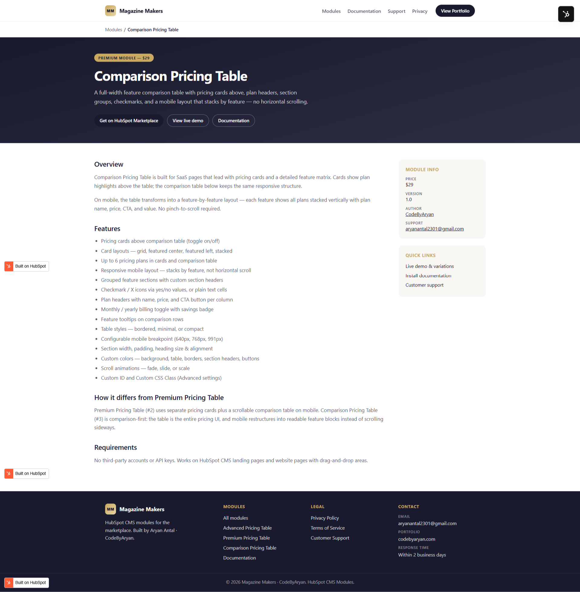
1/3 - Comparison Pricing Table Details
Overview
Comparison Pricing Table is a premium, fully responsive pricing module for HubSpot CMS — built for SaaS, agencies, and product teams that need both eye-catching pricing cards and a detailed feature-by-feature comparison table in one module.
Show 2 to 6 pricing plans as cards with a monthly/yearly billing toggle, featured plan highlighting, and per-plan CTAs — then let visitors dig deeper with a structured comparison table that groups features into sections and supports yes/no checkmarks, custom text values, and tooltips. Choose from four card layouts (Standard Grid, Featured Center, Featured Left, Stacked) and three table styles (Bordered, Minimal, Compact), all controlled from the Style tab. No code required.
Includes:
2–6 pricing cards (repeater) with descriptions, prices, and CTAs
Monthly / yearly toggle with savings badge and default-period control
Featured plan highlighting with gradient/solid/outline badge styles
Full feature-comparison table with grouped sections, rows, and tooltips
yes/no checkmark values or free text (e.g. "100 GB", "Unlimited")
Four card layouts + three table styles + column count control
Optional scroll animations (fade, slide, scale)
Extensive style controls — colors, radius, spacing, padding, alignment, button style
Custom ID and Custom CSS Class (Advanced settings)
Fully responsive with a configurable mobile breakpoint
Built by CodeByAryan for Magazine Makers. No third-party accounts, API keys, or paid services required.
Features
Detailed Feature Comparison Table
Go beyond cards with a structured comparison table that groups features into titled sections and rows. Use yes/no for checkmarks or plain text like "100 GB" and "Unlimited" — with optional tooltips for extra context.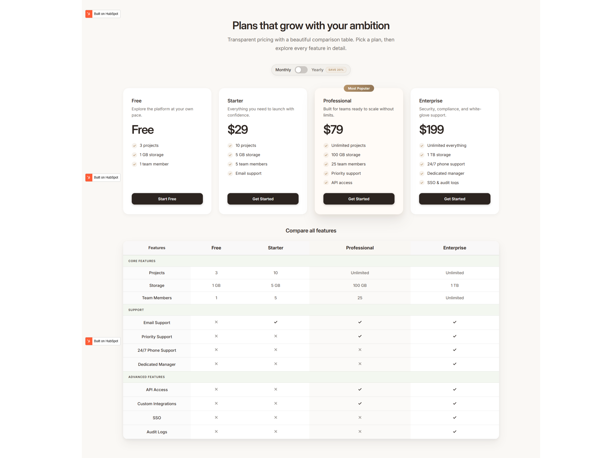
Cards + Table in One Module
Display 2–6 pricing cards with prices, descriptions, and CTAs, then reinforce them with a full comparison table below. Toggle cards off to show prices and buttons directly in the table header instead.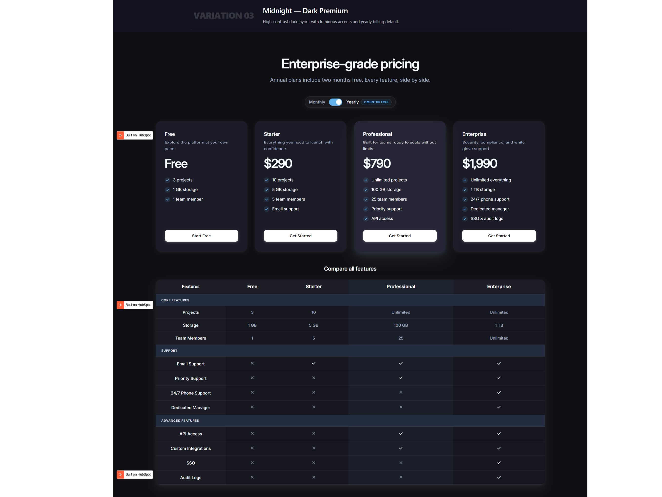
Flexible Layouts & Table Styles
Pick from four card layouts (Standard Grid, Featured Center, Featured Left, Stacked), three table styles (Bordered, Minimal, Compact), and control the desktop column count — all from the Style tab.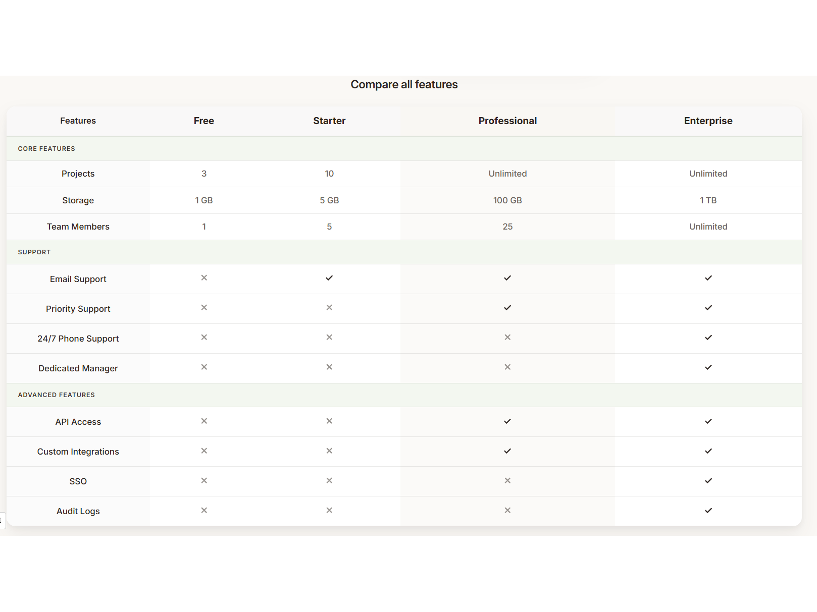
Fully Customizable & Responsive
Control colors, corner radius, spacing, padding, alignment, button style, and optional scroll animations. The layout adapts to a configurable mobile breakpoint with optional CTA buttons on small screens.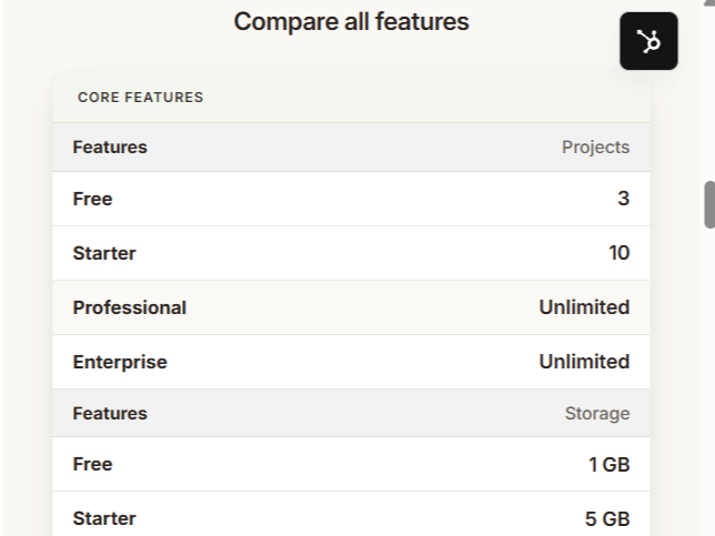
About Module
Total installs Fewer than 10 Created - Jun 22, 2026
Version 1 - Jun 22, 2026
Categories Tags
Requirements
HubSpot Subscription Works with all HubSpot plans
Contact Magazine Makers
Legal Stuff
Please refer to the developer's Privacy Policy and Terms for more information.
Support
Magazine Makers
- Remote
Visit website
Magazine Makers builds production-ready HubSpot CMS modules and high-performance websites for SaaS, agencies, and service brands. Founded by senior HubSpot CMS developer Aryan Antal (CodeByAryan), we create marketplace-ready modules that marketers can configure without code — including pricing tables, comparison layouts, and before/after sliders — plus bespoke theme and module development when off-the-shelf solutions are not enough. Every release is documented, supported, and built with clean HubL, responsive layouts, and performance in mind.
Bug fixes for reported module issues
Installation and setup guidance
Help with module configuration and settings
Compatibility support with standard HubSpot themes
Basic usage guidance via email support
Magazine Makers typically responds in
- Sunday
8:00 PM - 10:00 PM (IST) - Monday
10:00 AM - 7:00 PM (IST) - Tuesday
10:00 AM - 7:00 PM (IST) - Wednesday
10:00 AM - 7:00 PM (IST) - Thursday
10:00 AM - 7:00 PM (IST) - Friday
10:00 AM - 7:00 PM (IST) - Saturday
8:00 PM - 10:00 PM (IST)
